





OUO Packaging Factory|紙材容器製造商
品牌識別設計|Brand Identity Design
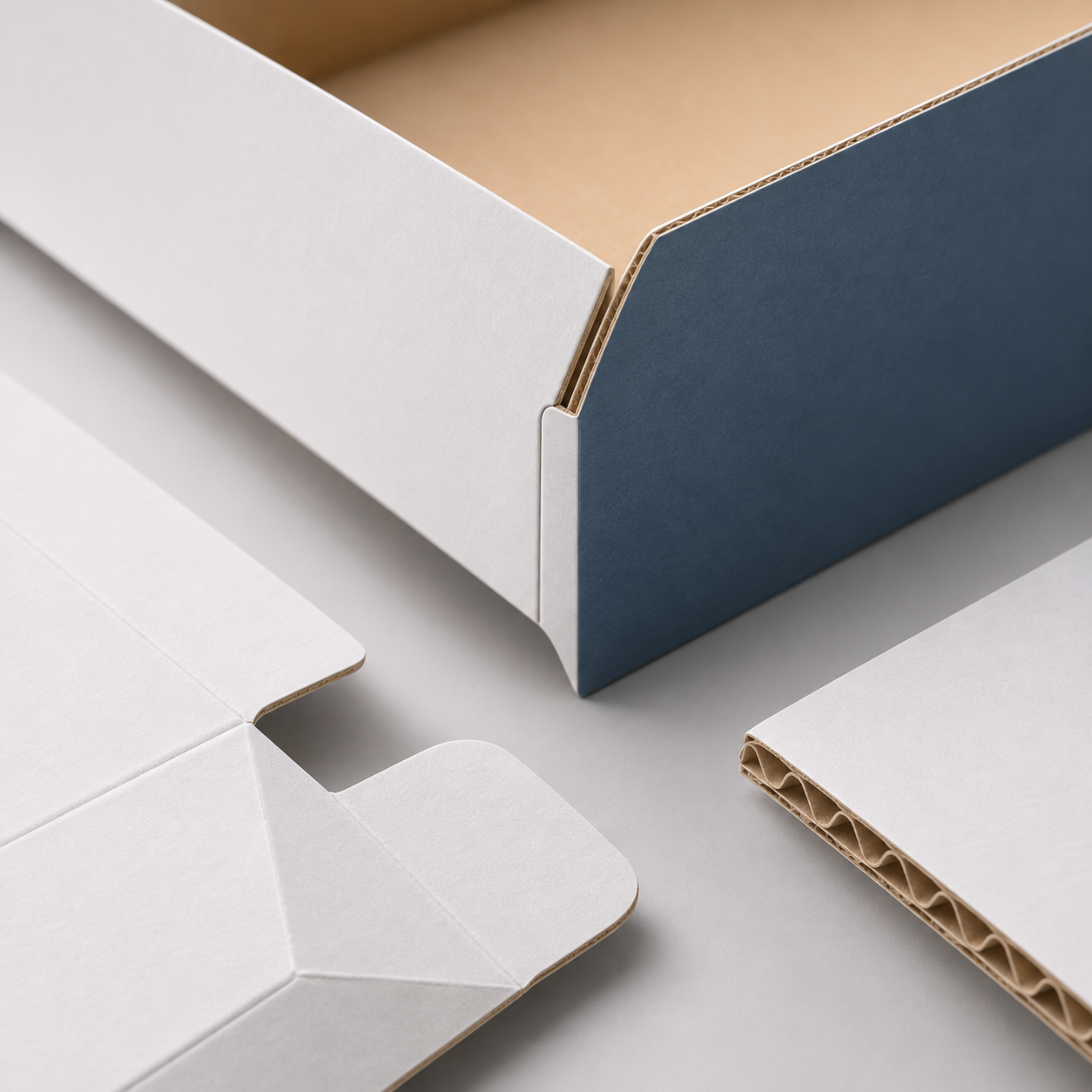
以紙為起點,從平面延伸至空間。
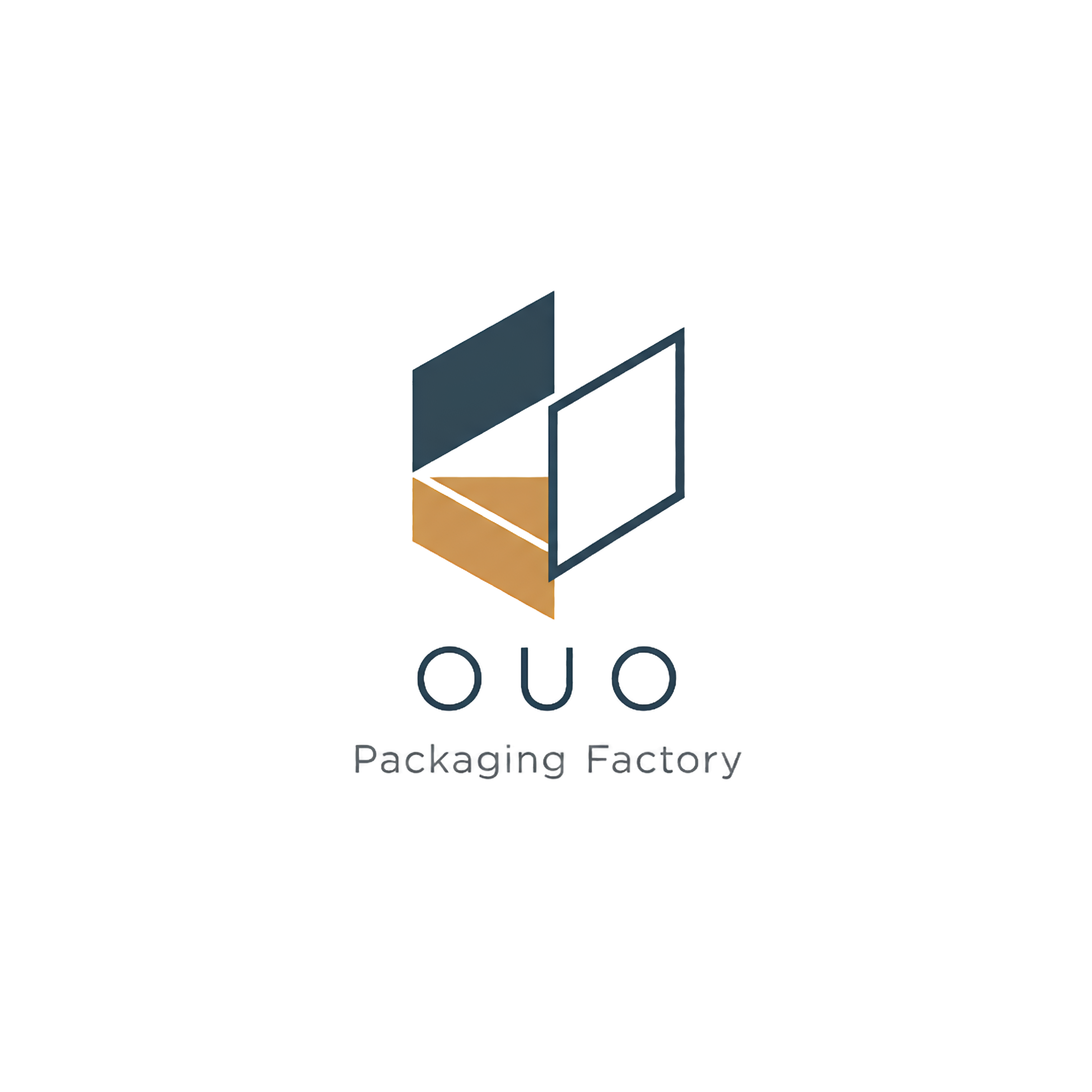
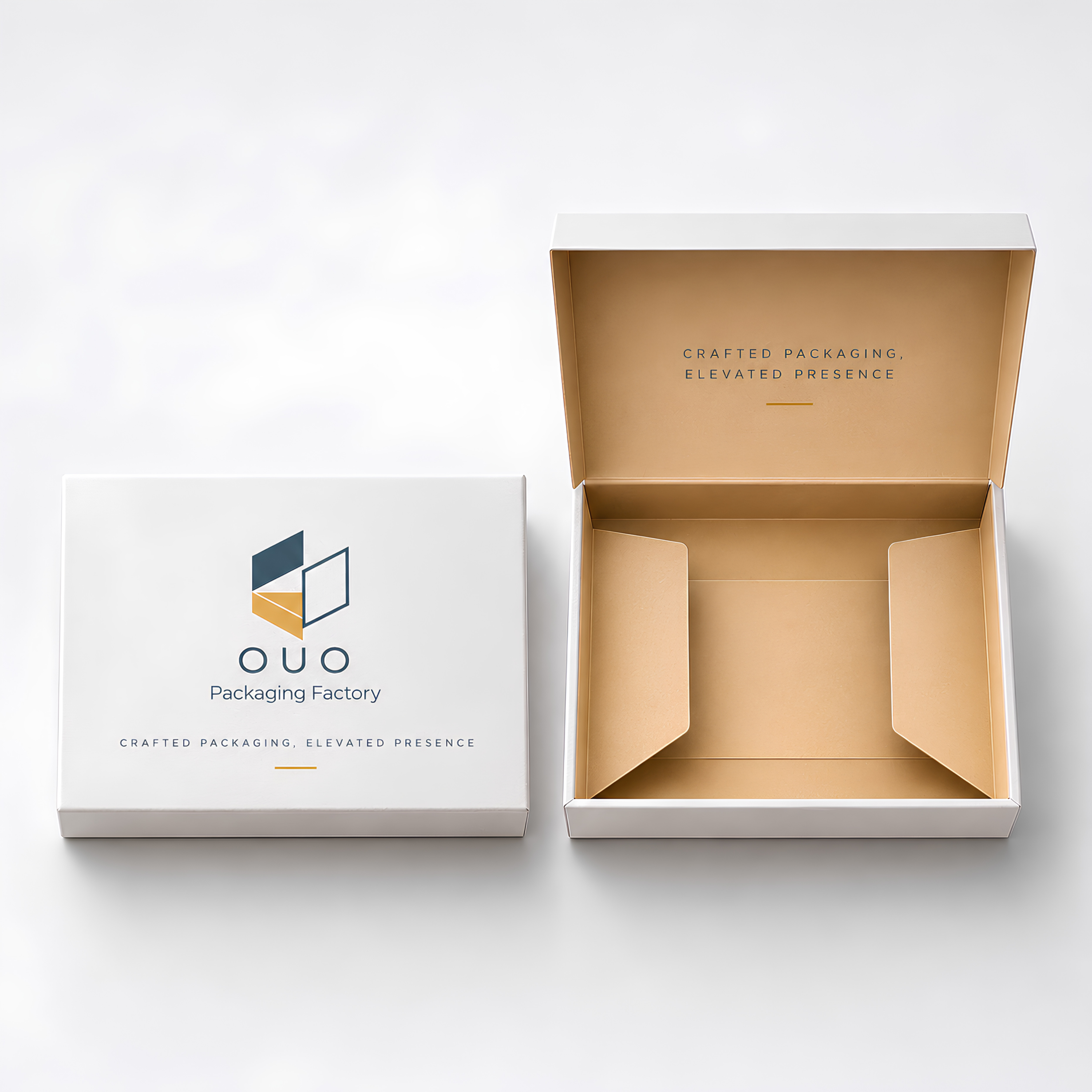
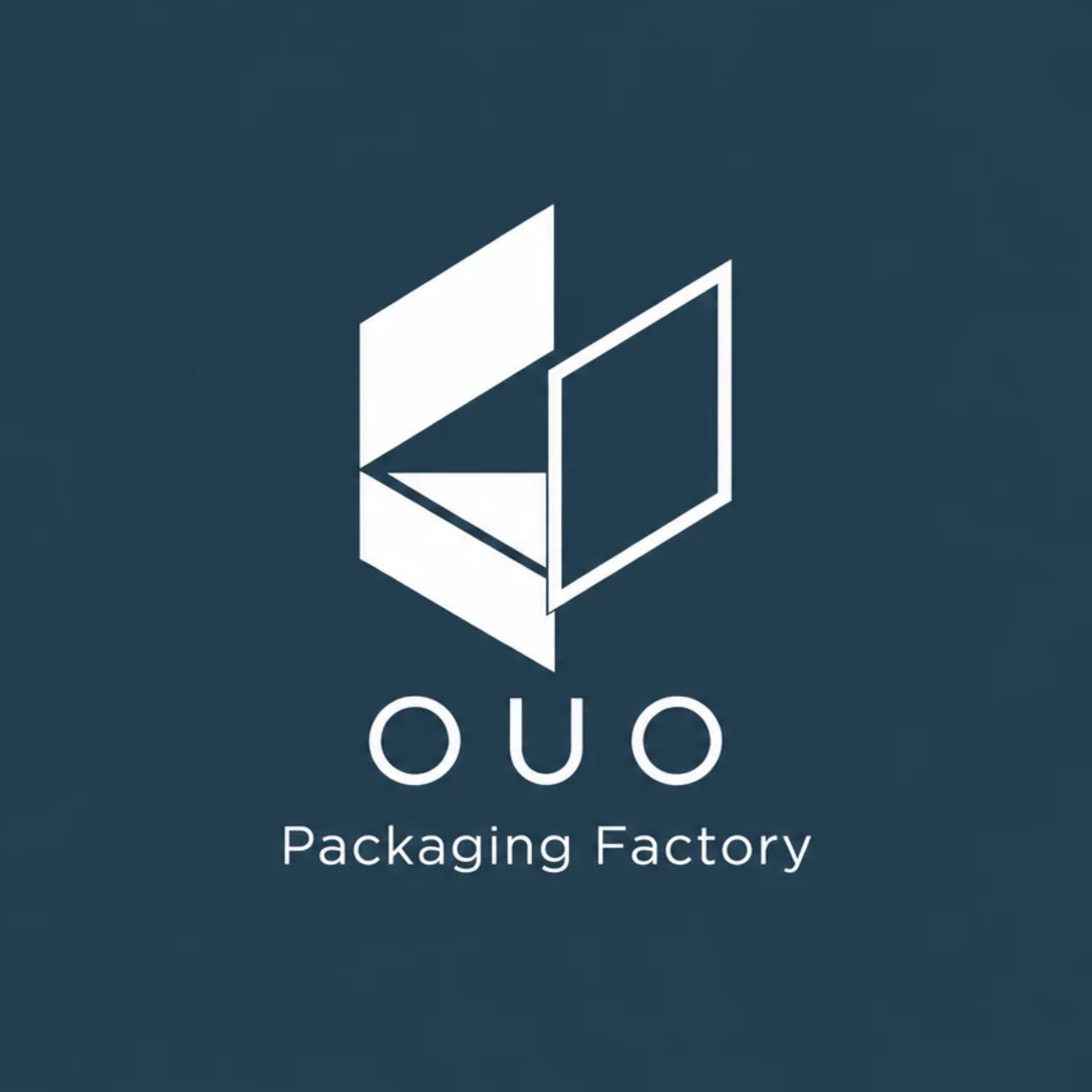
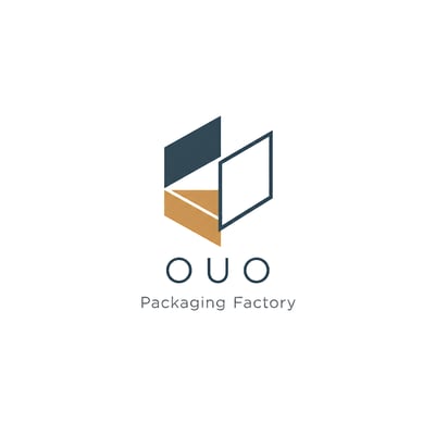
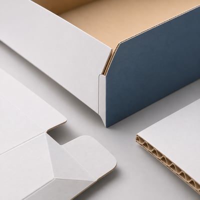
OUO 的標誌取自紙器折疊與展開的結構,透過簡潔的幾何切面、線條與留白,將紙張由平面轉化為立體的過程,凝縮成具有辨識度的視覺符號。
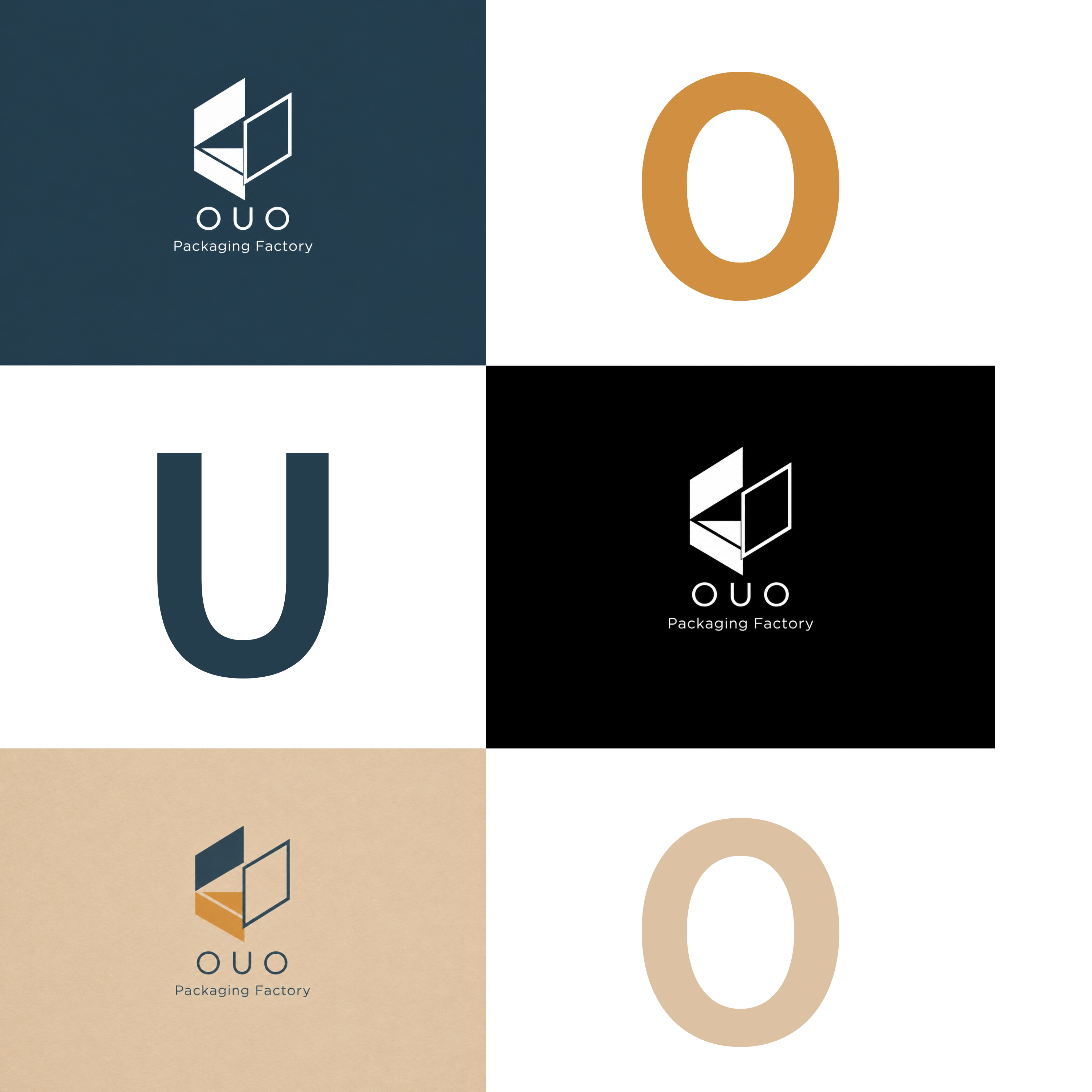
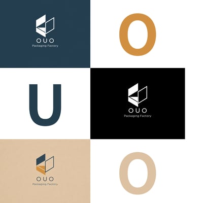
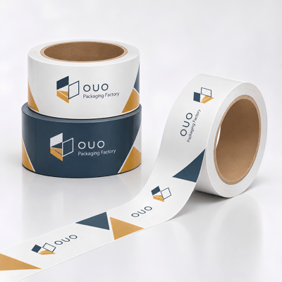
深石板藍傳達製造的精準與穩定,暖金色呼應紙材的自然質地。實心與鏤空的交錯,則呈現紙器結構中開合、堆疊與空間轉換的關係。
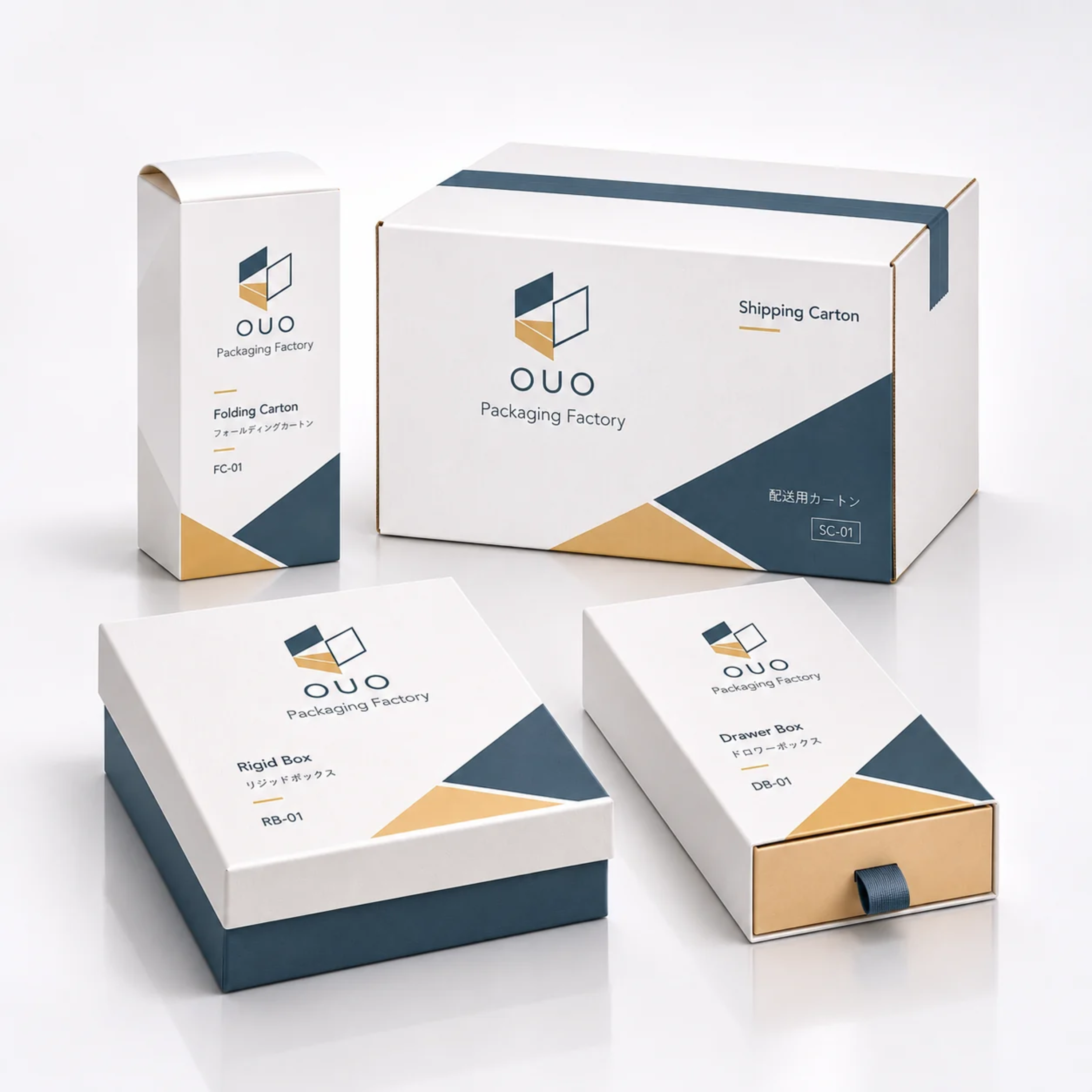
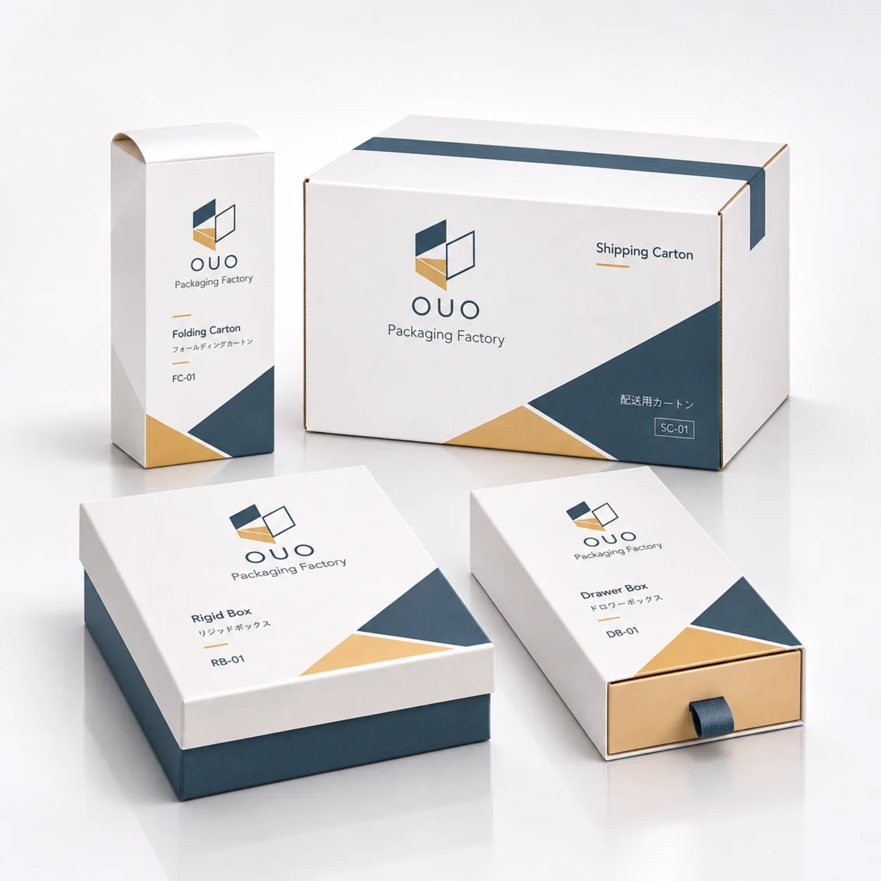
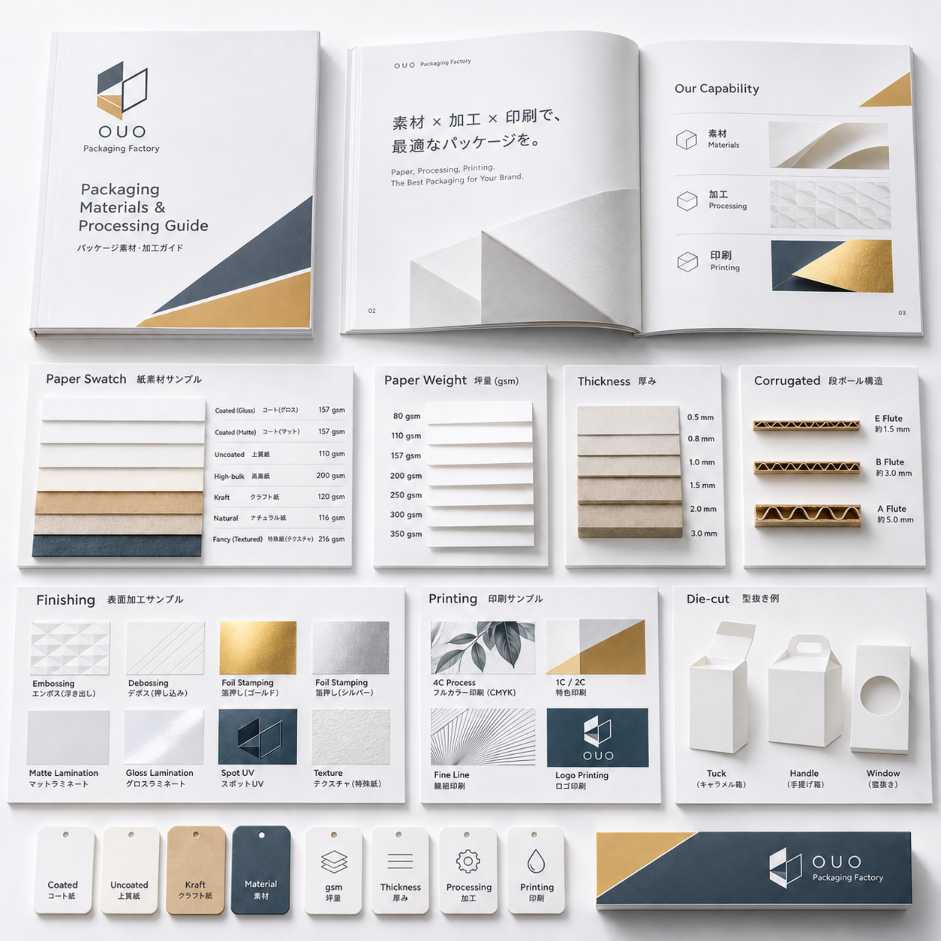
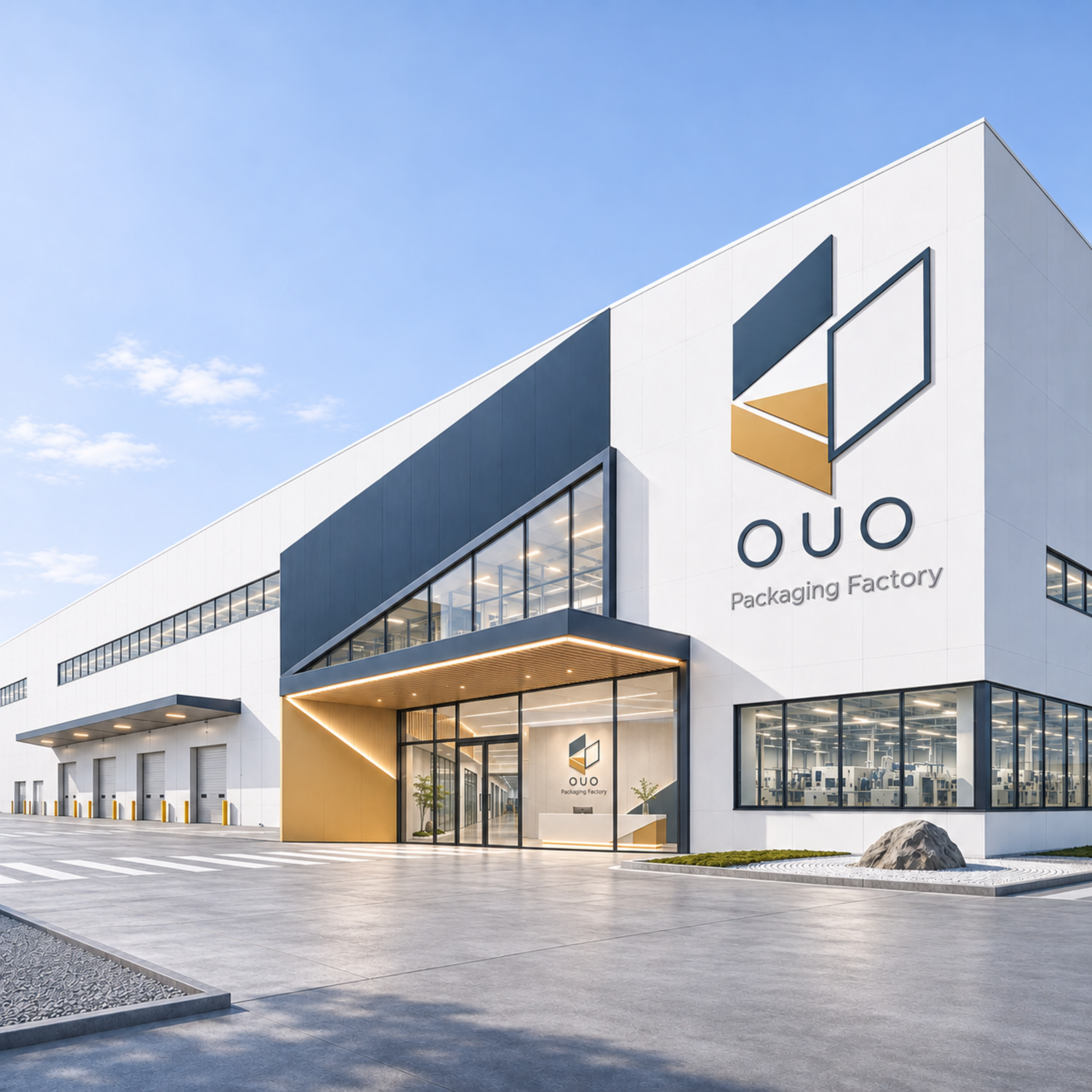
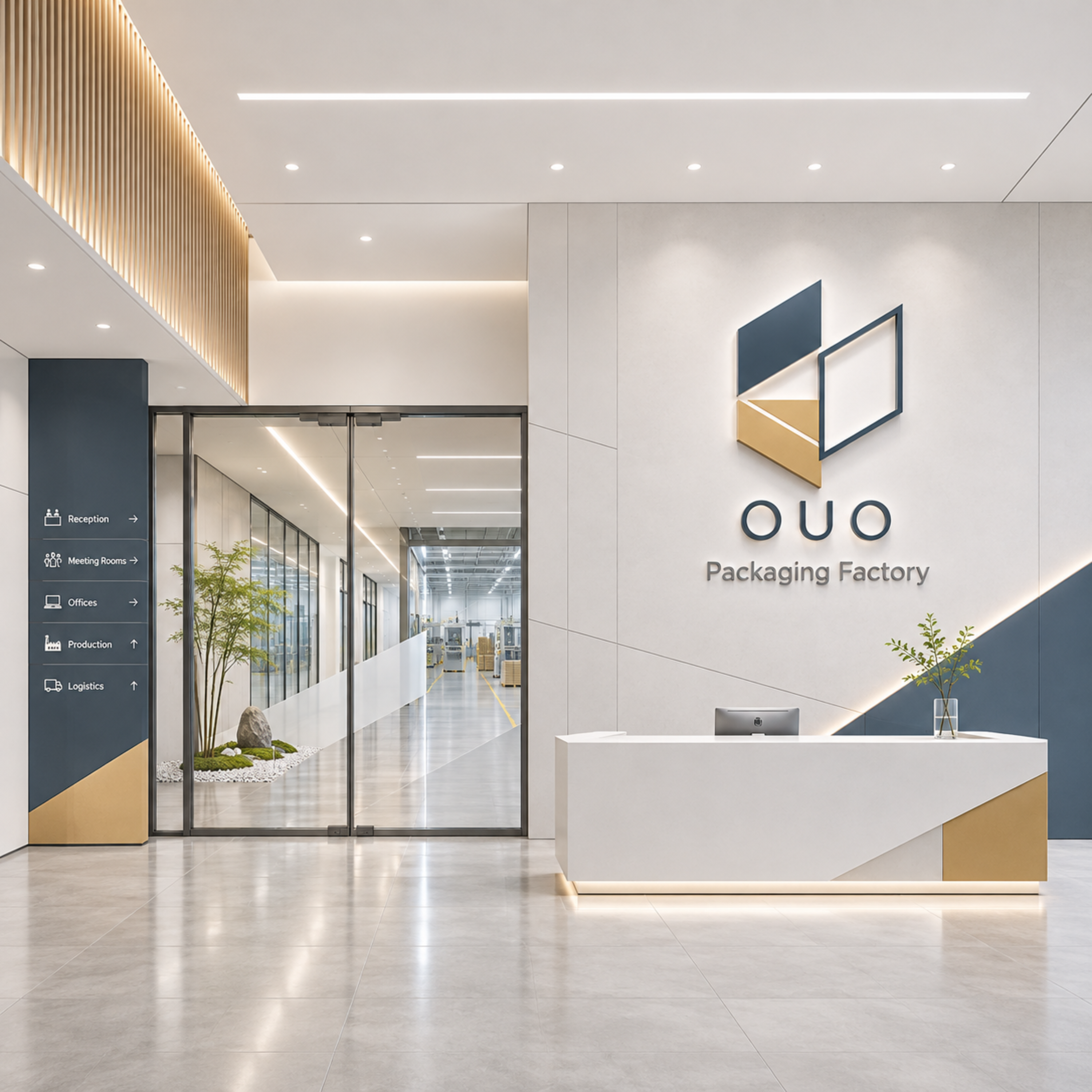
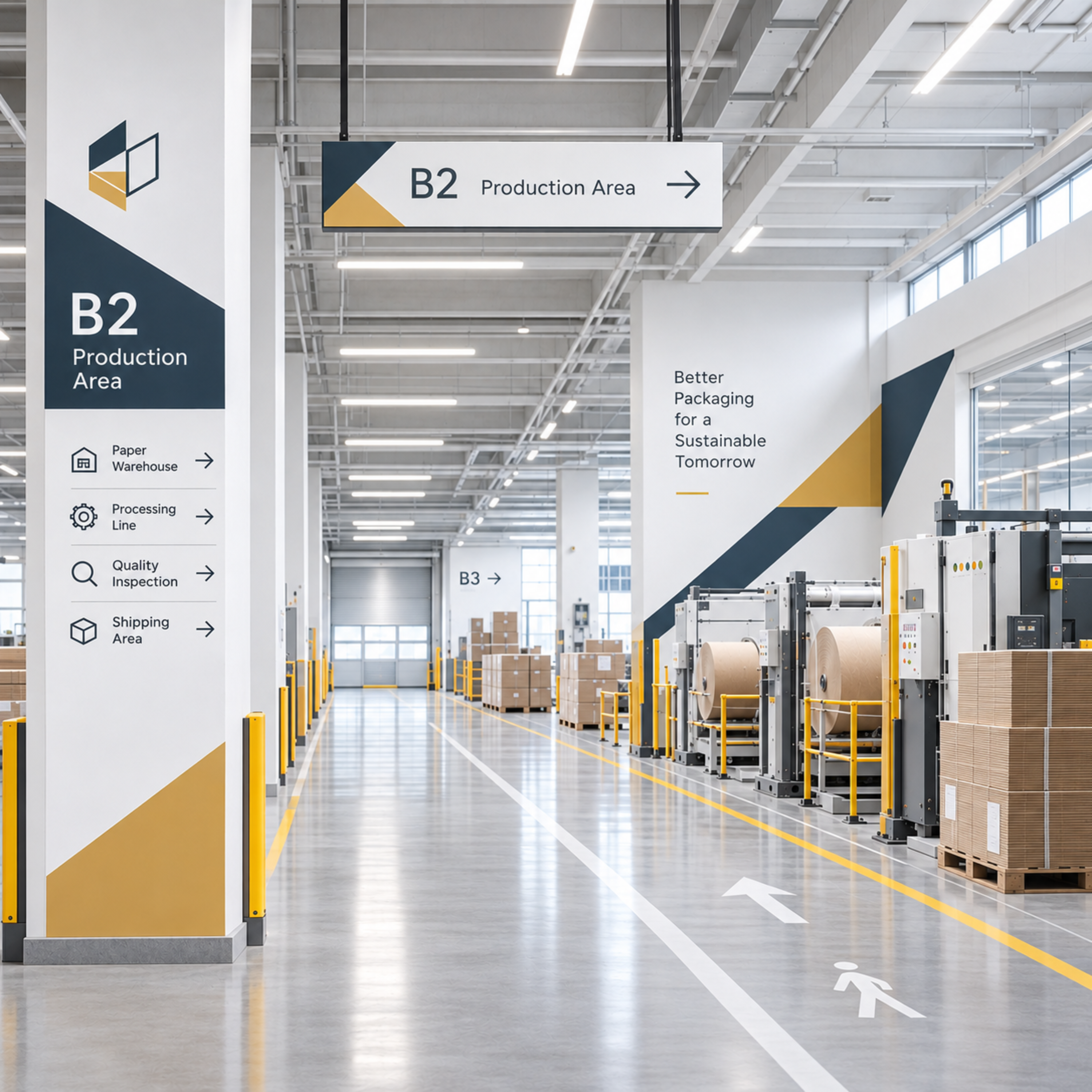
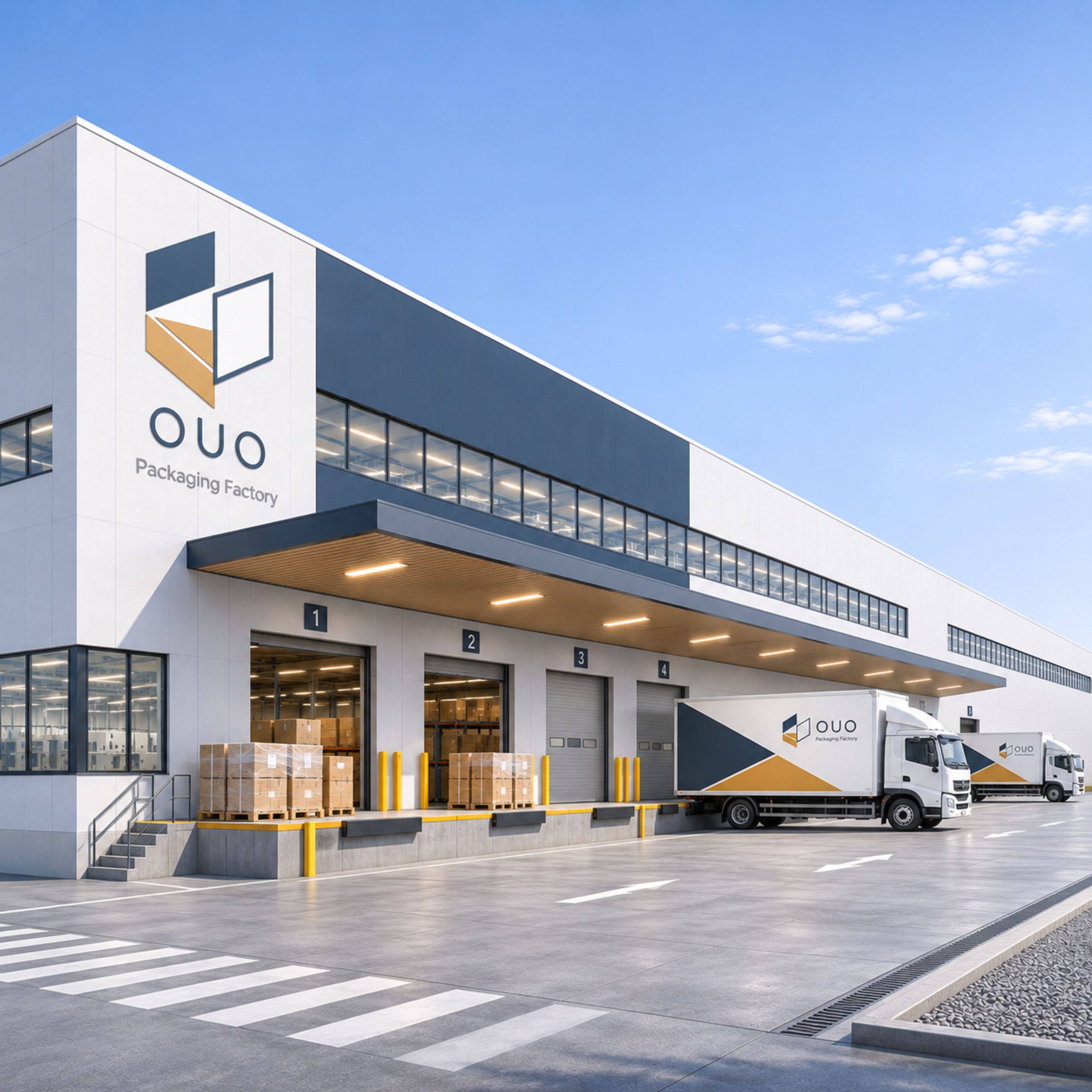
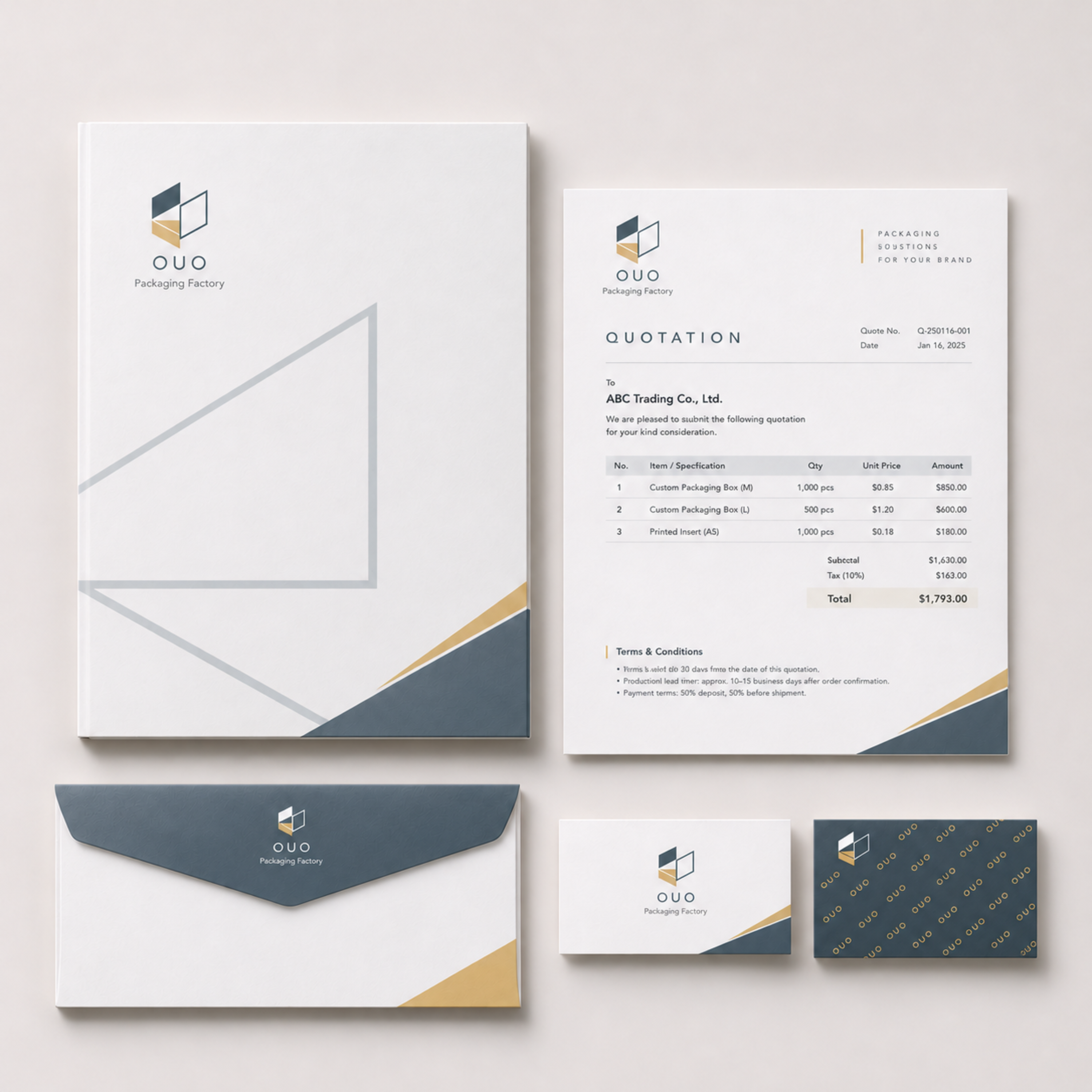
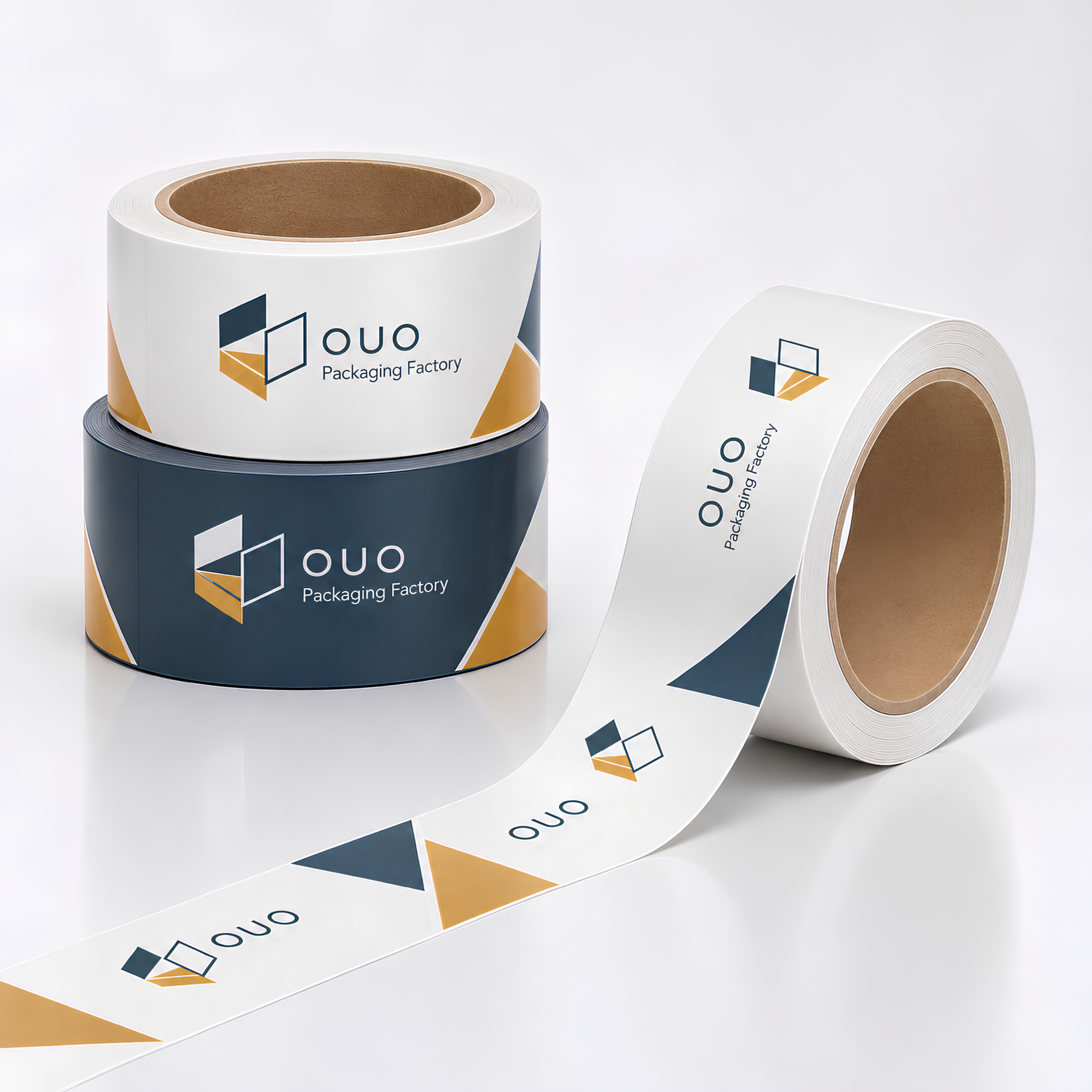
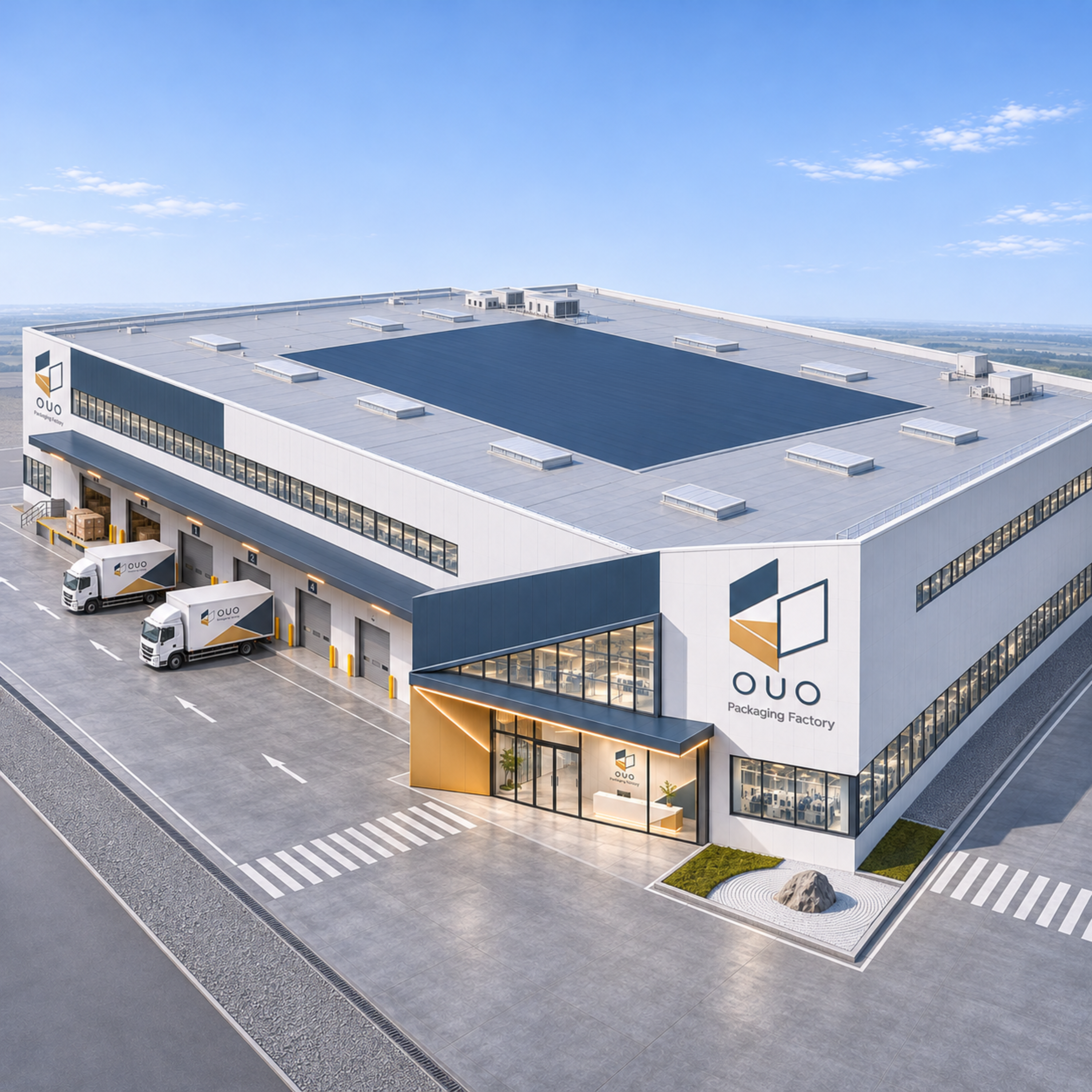
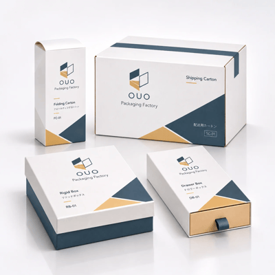
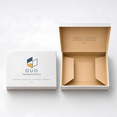
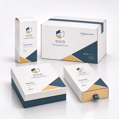
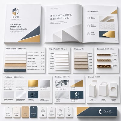
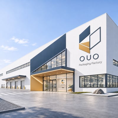
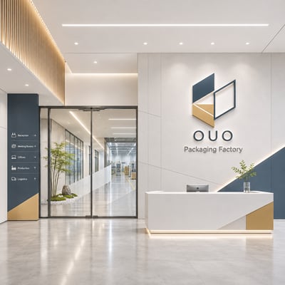
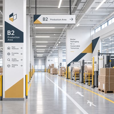
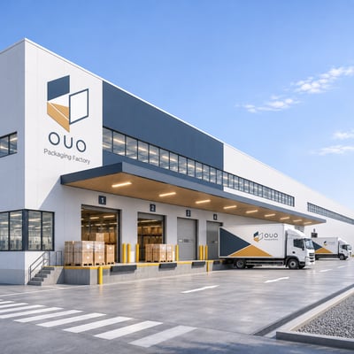
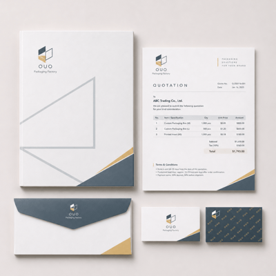
設計不止於標誌本身,而是將幾何語言延伸至包裝、建築、空間導視與企業識別,讓不同媒介維持一致的品牌印象。
從一張紙的結構,建立一個品牌的形象。
OUO Packaging Factory | Brand Identity Concept
From Paper to Form. From Two Dimensions to Three.
The visual identity of OUO draws inspiration from the structural principles of paper packaging—folding, unfolding, and the transformation of flat surfaces into three-dimensional forms.
Through a refined composition of geometric planes, precise lines, and negative space, these fundamental characteristics are distilled into a distinctive visual symbol.
Deep slate blue conveys precision, stability, and manufacturing expertise, while warm gold reflects the natural qualities of paper. The interplay between solid and open forms expresses the relationships between folding, layering, and spatial transformation.
Beyond the logo, this geometric language extends across packaging, architecture, spatial wayfinding, and corporate communications, establishing a cohesive and recognizable brand identity across every touchpoint.
From the Structure of Paper to the Identity of a Brand.