
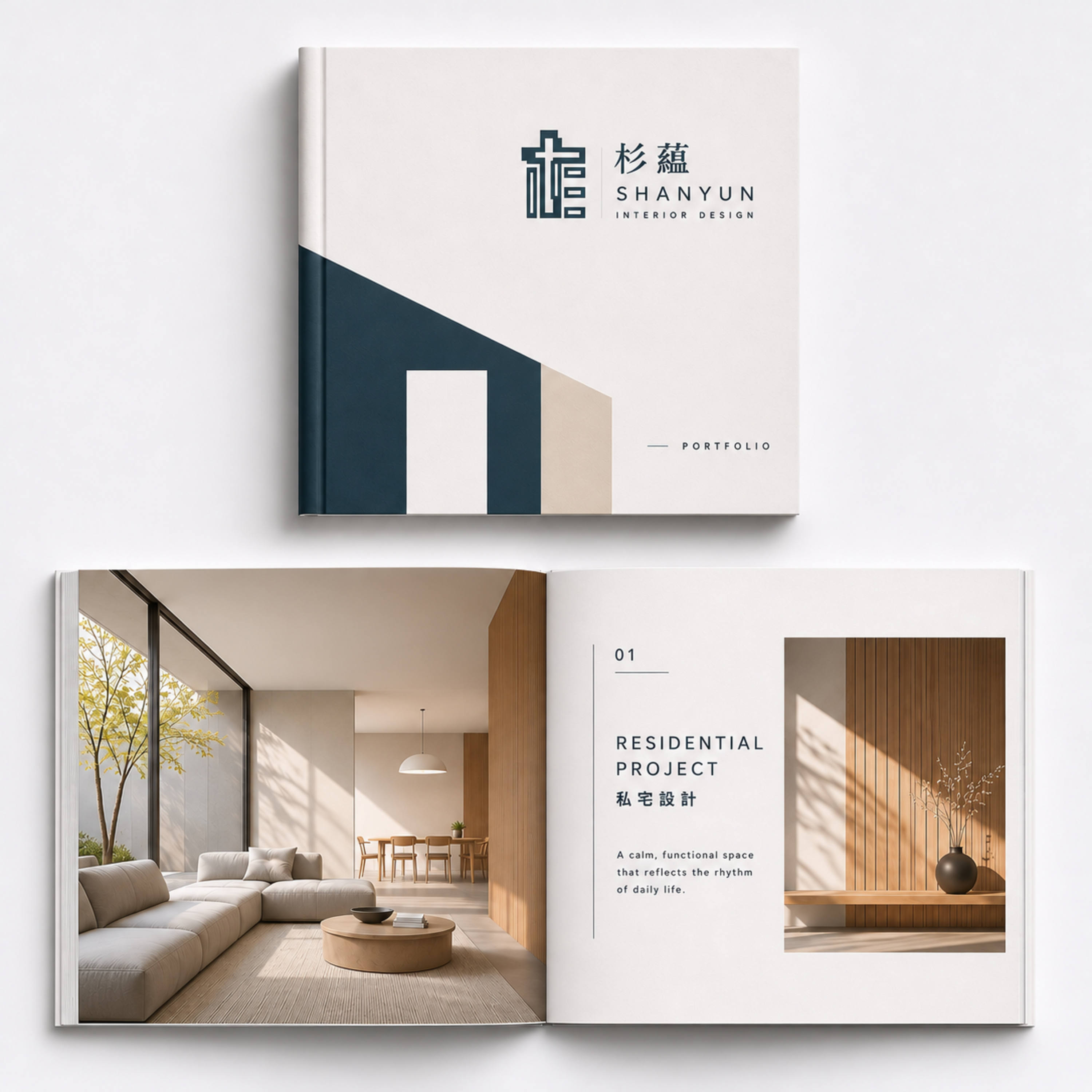
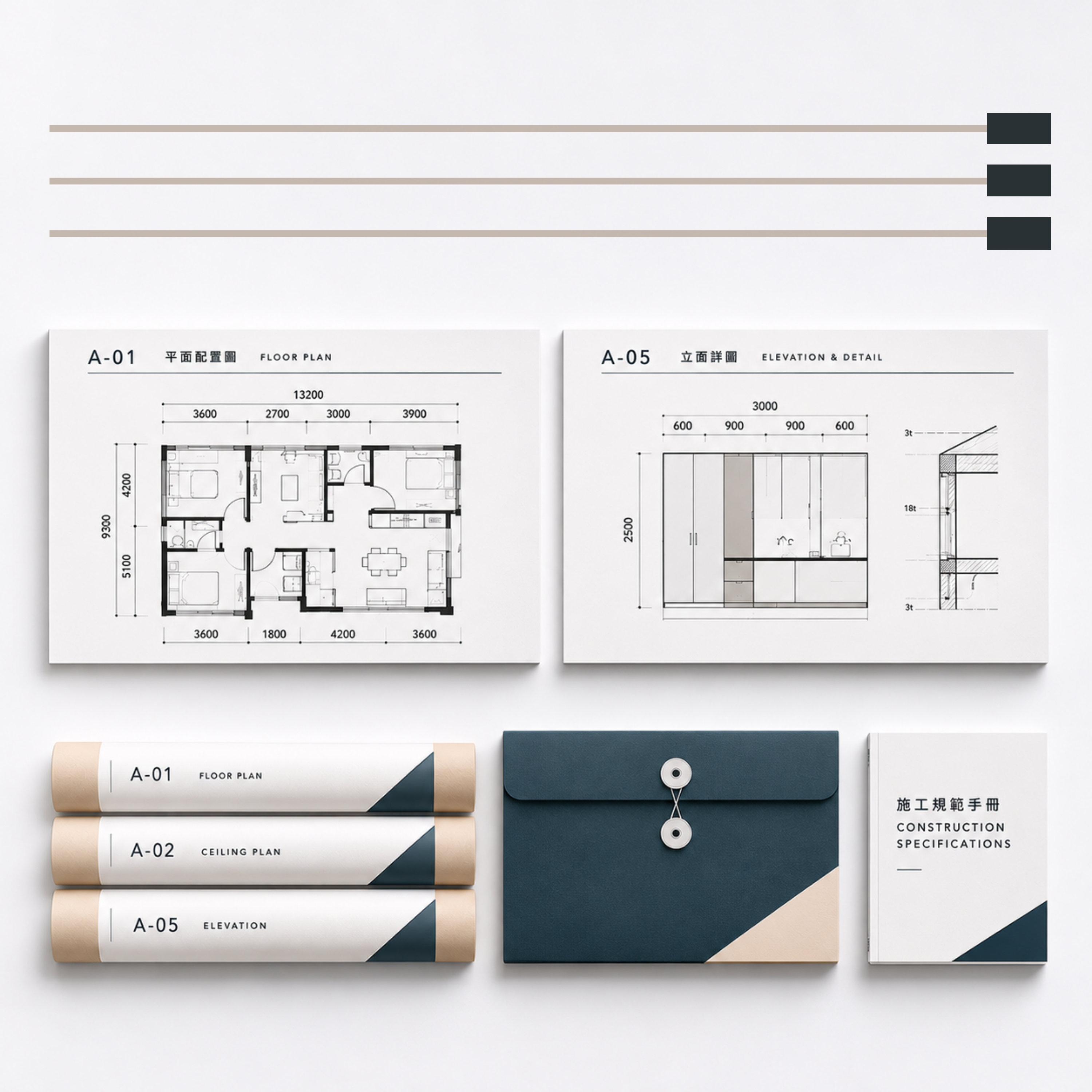
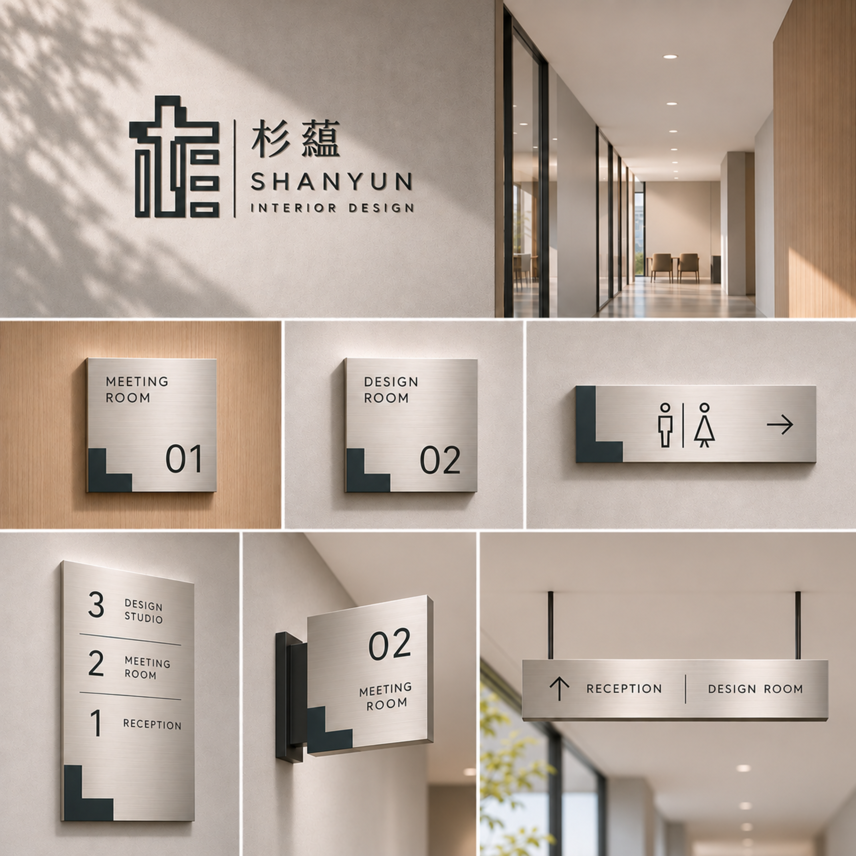
SHANYUN INTERIOR DESIGN 杉蘊室內設計
品牌識別設計|Brand Identity Design
杉蘊的識別,不是從裝飾開始,而是從空間的骨架開始。
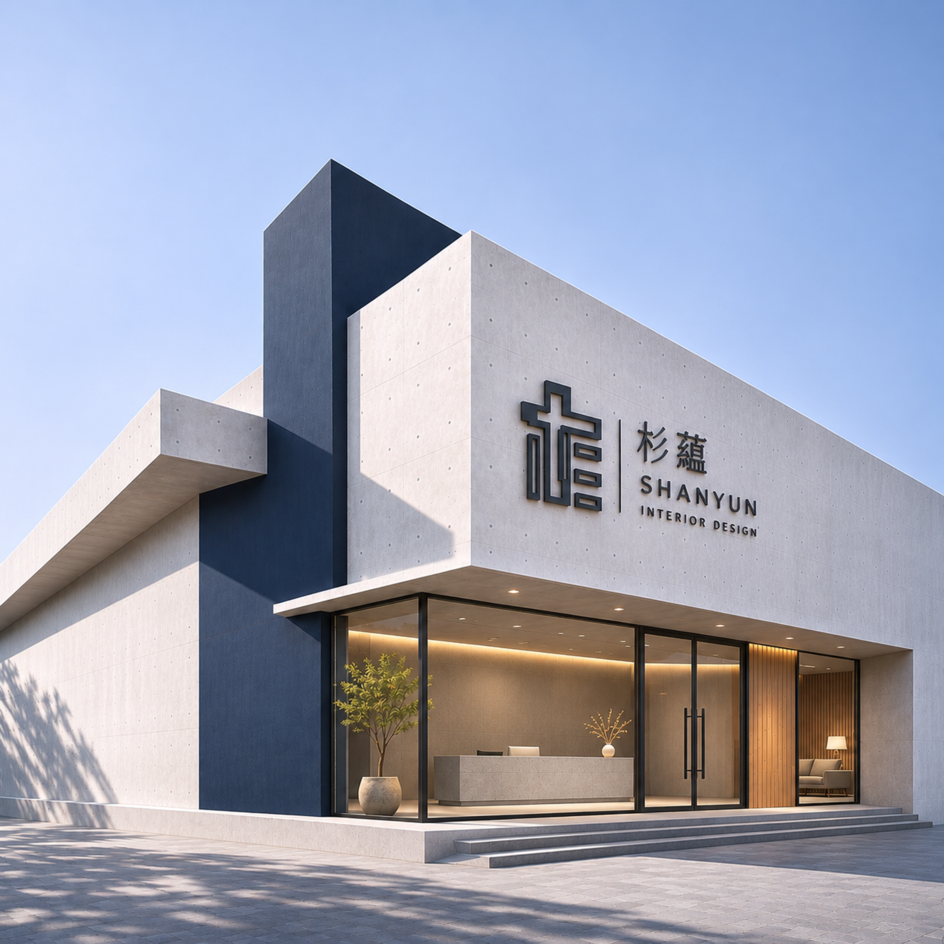
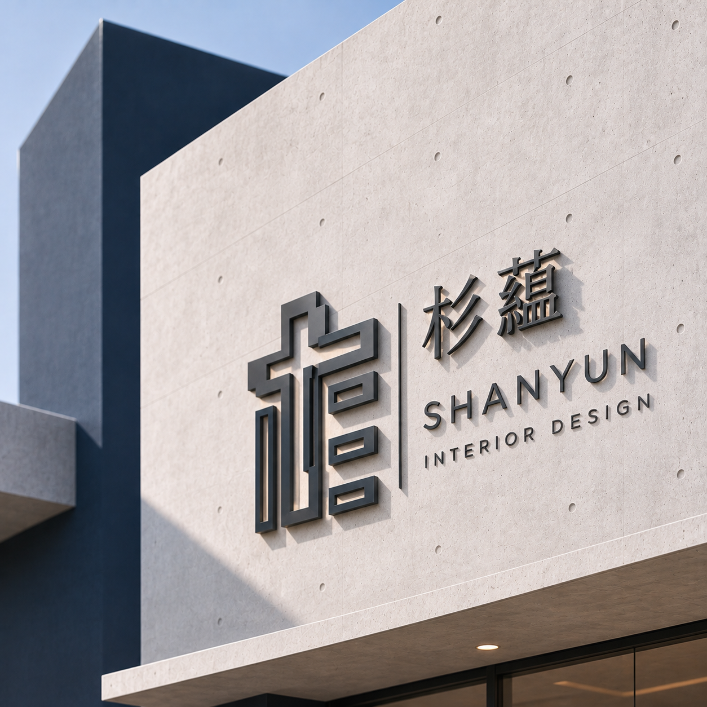
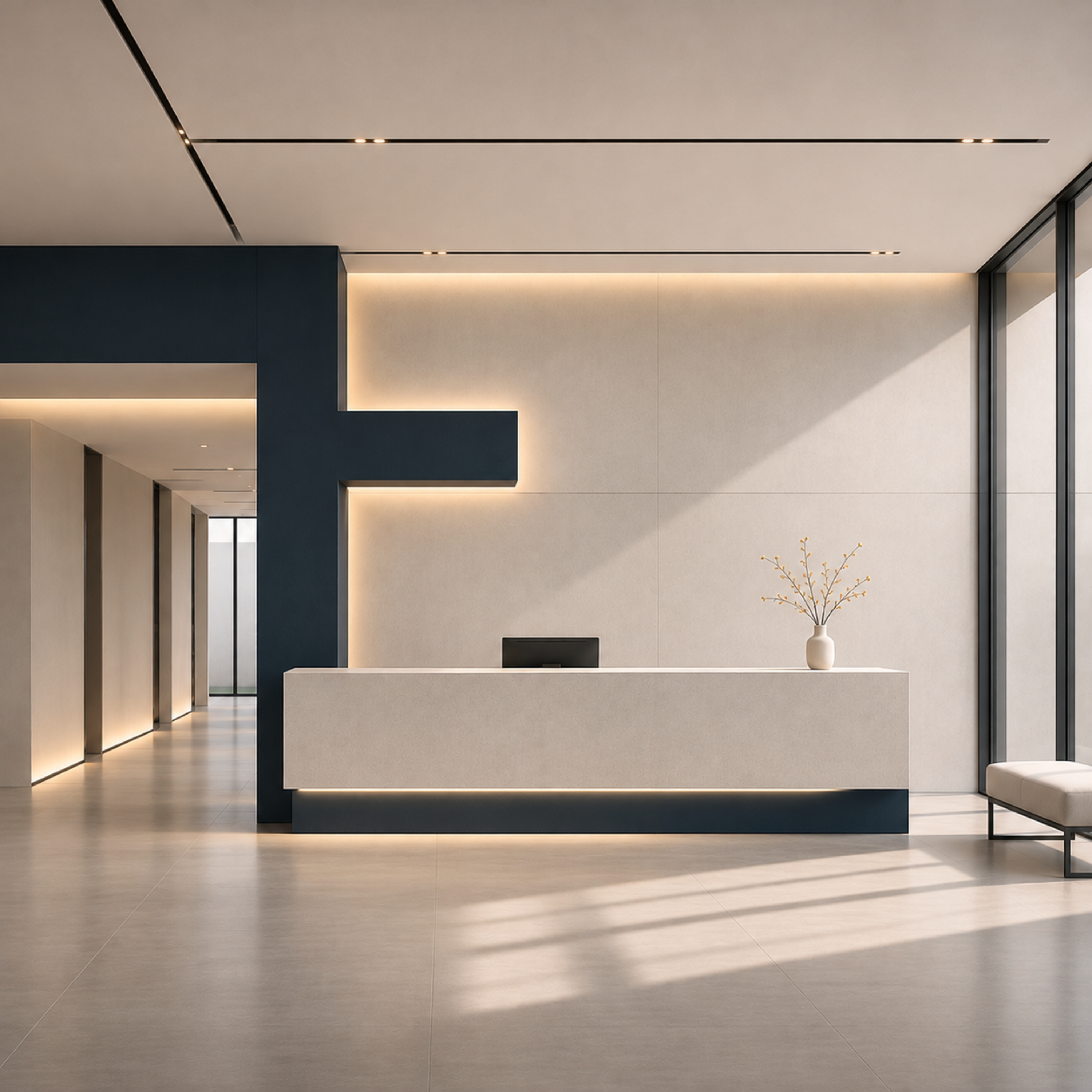
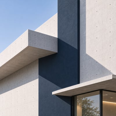
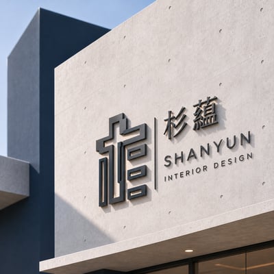
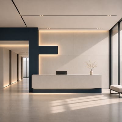
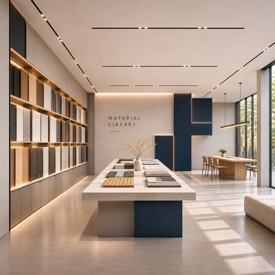
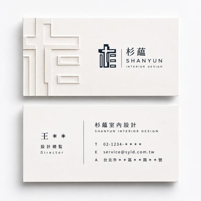
我們將標誌中的水平與垂直關係,轉化為建築量體、牆面切割、動線秩序與材質比例,讓品牌不只停留在圖像,而是延伸為一種可被感受的空間語言。
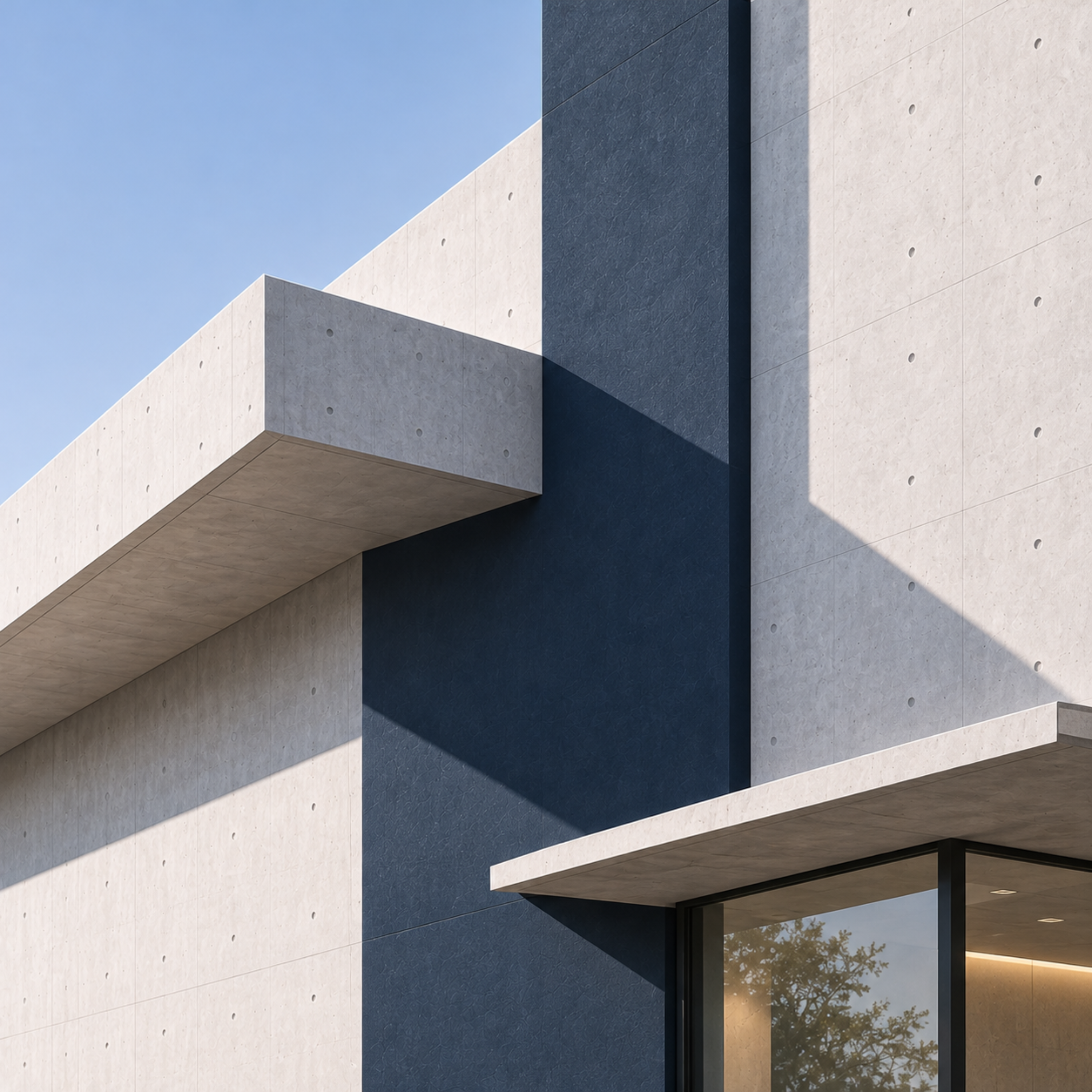
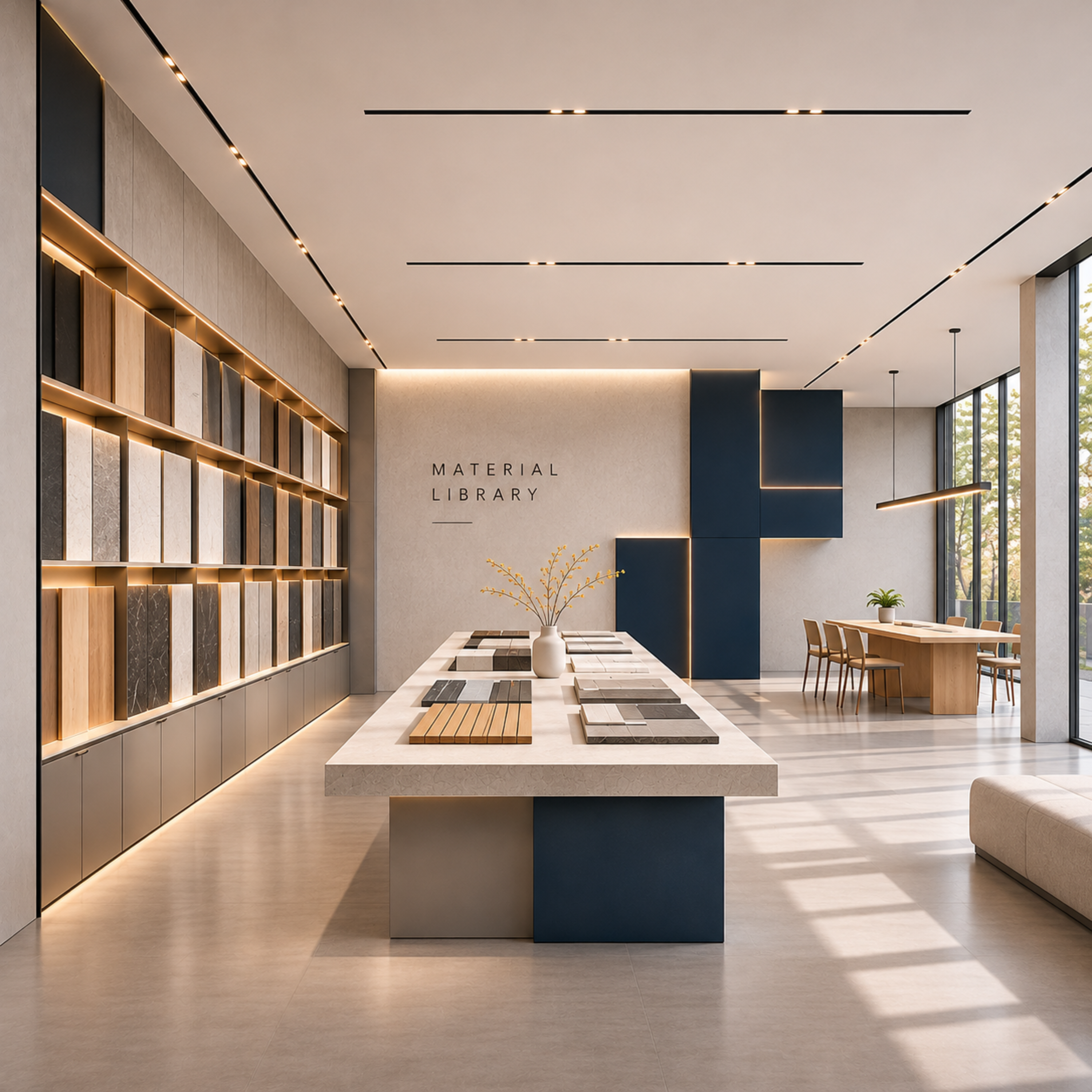
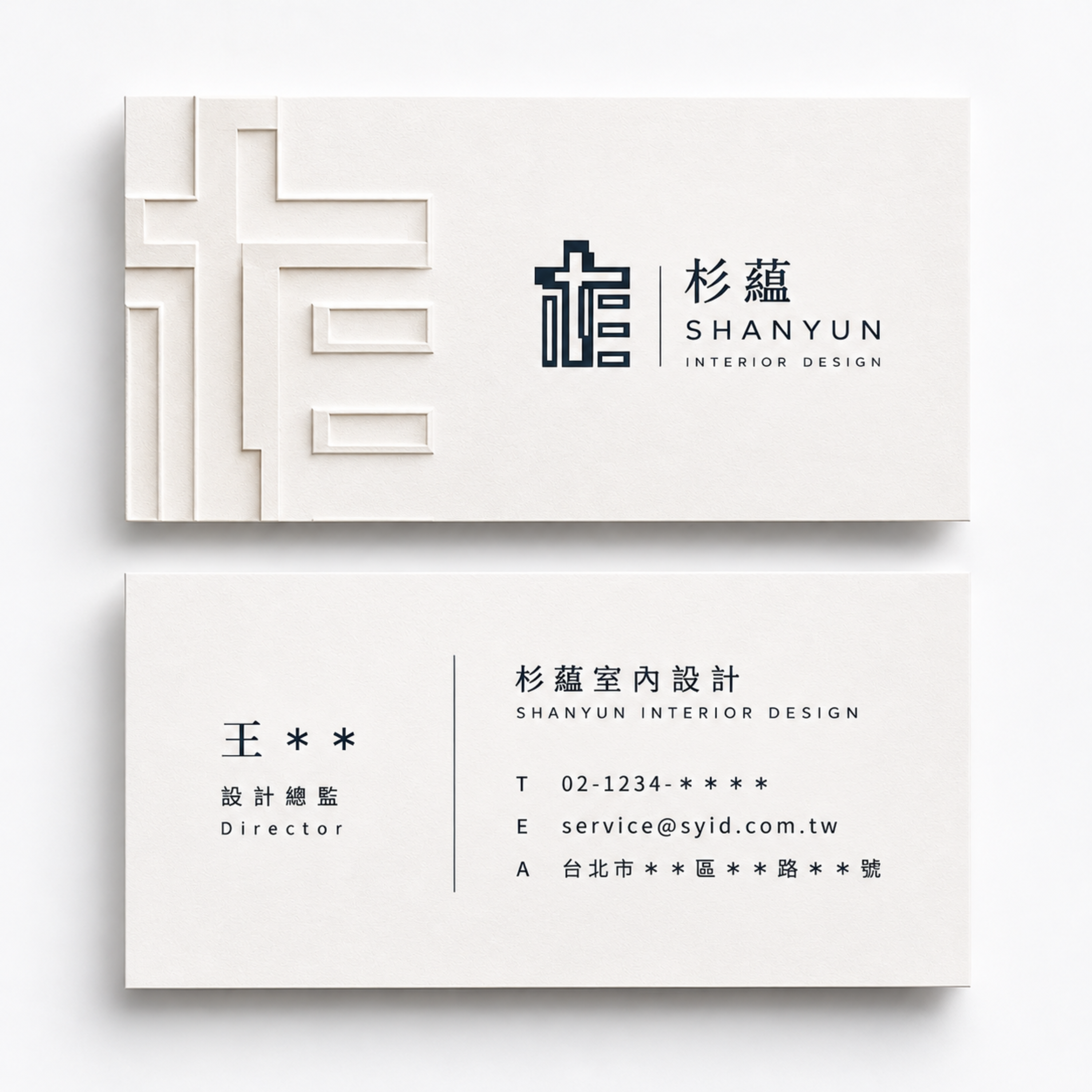
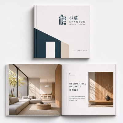
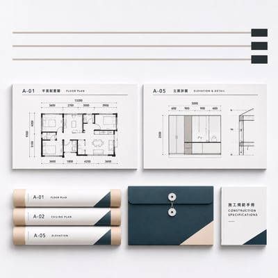
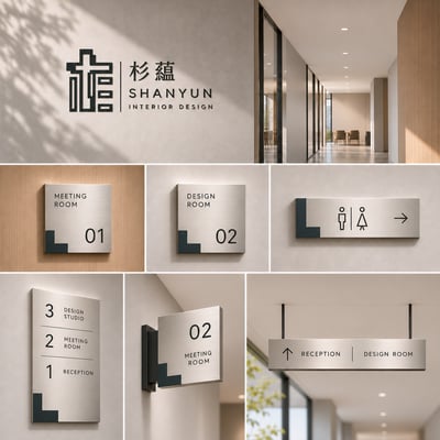
清水模的克制、深藍量體的穩定、木質細節的溫度,共同構成杉蘊的品牌表情。識別不被分散使用,而是被整合為建築、室內、平面與導視系統的一致邏輯。對我們而言,品牌的價值不在於被看見多少次,而在於每一次出現,都能準確傳達同一個核心。
杉蘊所追求的,不是形式上的極簡,而是秩序、尺度與質感的整合。讓標誌成為空間的起點,也讓空間成為品牌最完整的表現。
SHANYUN INTERIOR DESIGN
Design Concept
SHANYUN's visual identity begins not with decoration, but with the underlying structure of space.
The horizontal and vertical relationships embedded in the logo are translated into architectural volumes, façade compositions, spatial circulation, and material proportions. The identity extends beyond a graphic symbol to become a spatial language that can be experienced.
The restraint of exposed concrete, the solidity of deep-blue architectural forms, and the warmth of natural wood collectively define SHANYUN's brand character.
Rather than applying the identity as a series of isolated elements, we establish a unified design system across architecture, interiors, graphic communication, and wayfinding. The value of a brand lies not in how often it appears, but in how consistently each expression communicates its core identity.
SHANYUN pursues more than minimalism as a visual style. It seeks the integration of order, proportion, and materiality.
The logo becomes the foundation of space, and space becomes the fullest expression of the brand.