

苗寵物| SEEDLING PET
品牌識別設計|Brand Identity Design
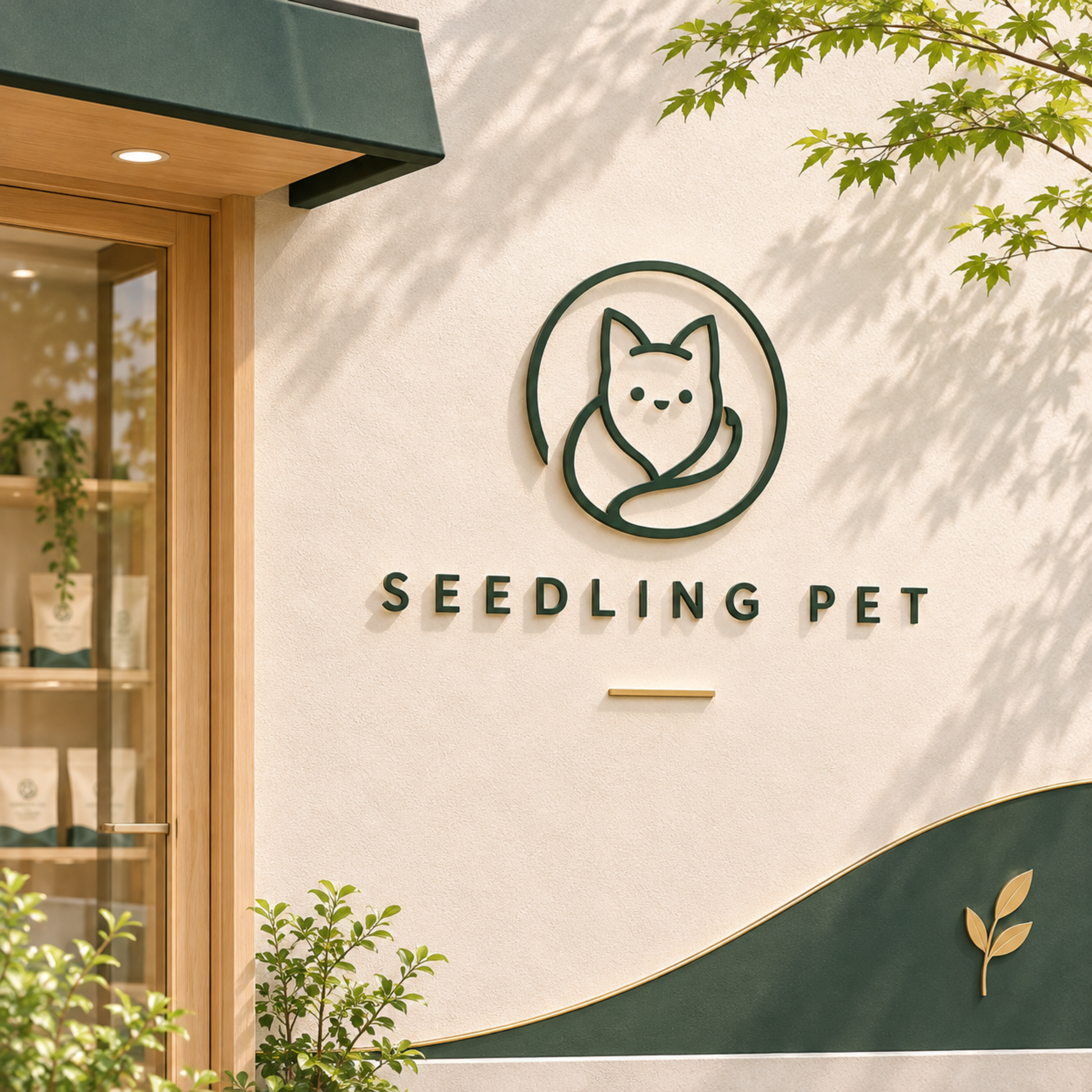
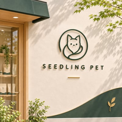
以貓的輪廓為起點,將耳朵表情與身體曲線整合為一個簡潔而鮮明的符號。
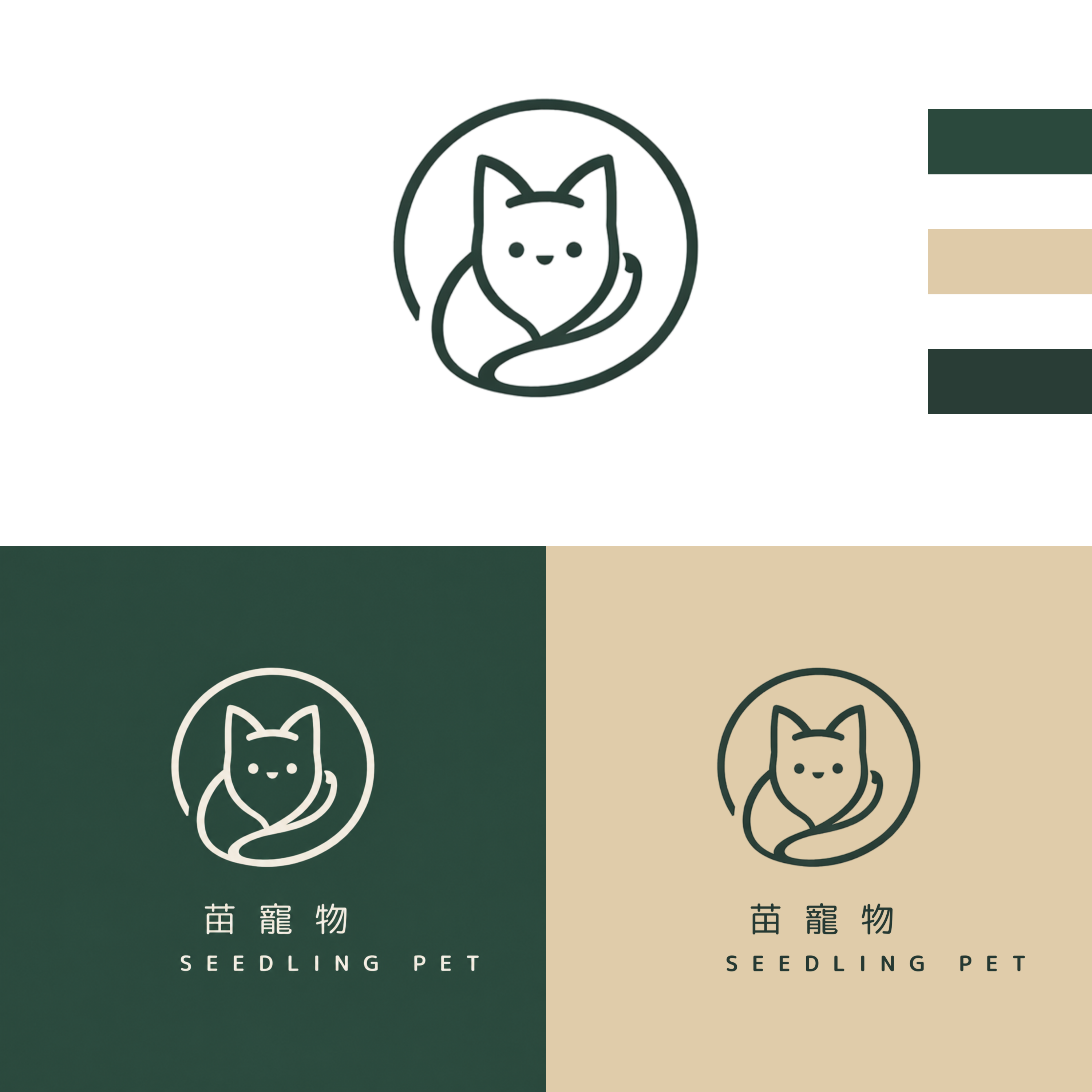
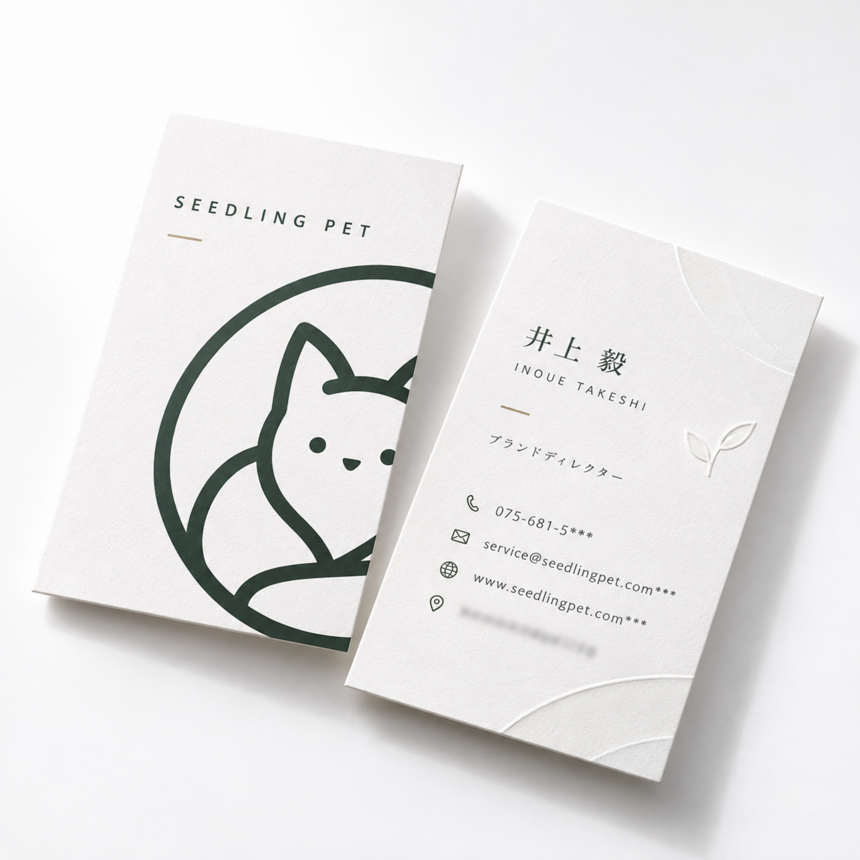
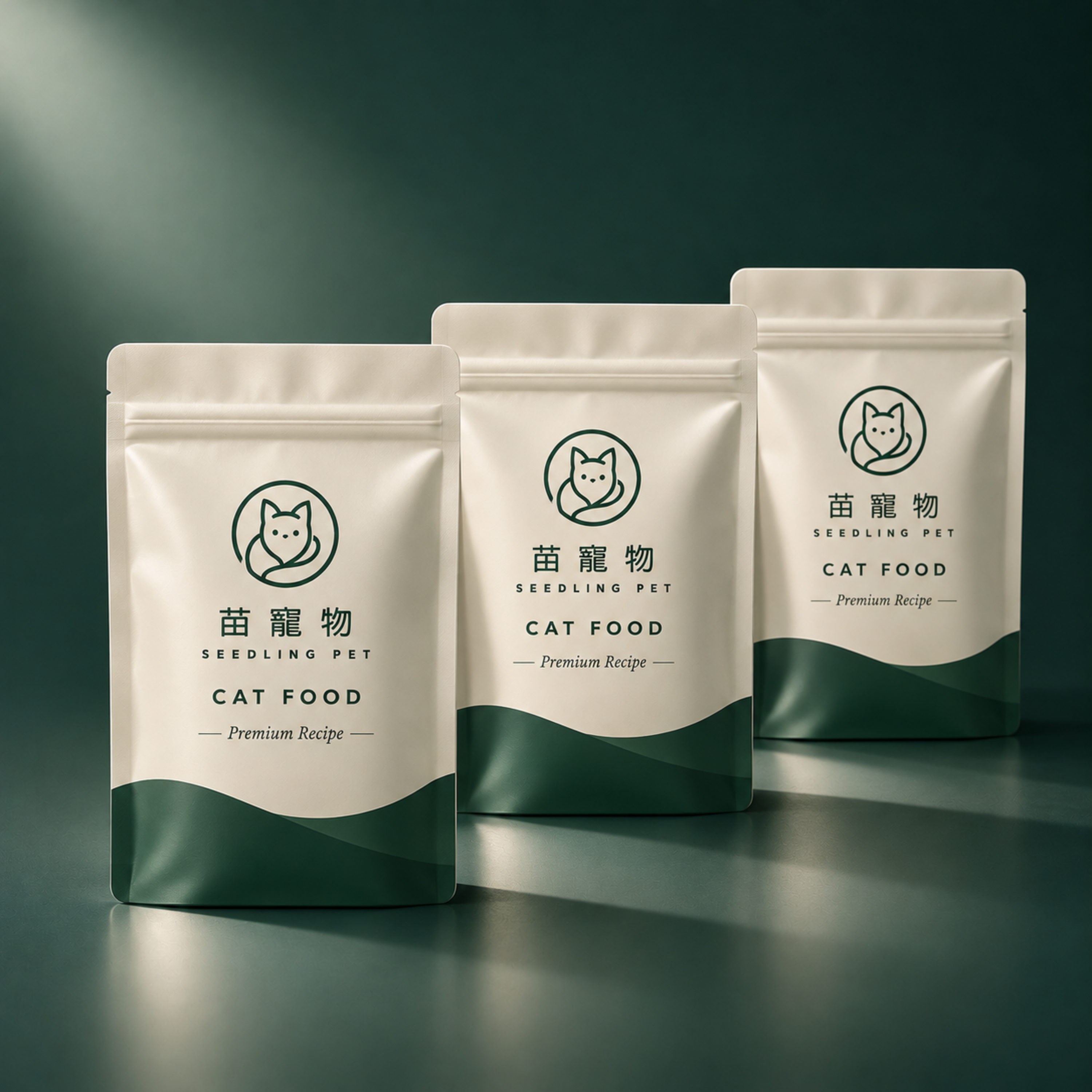
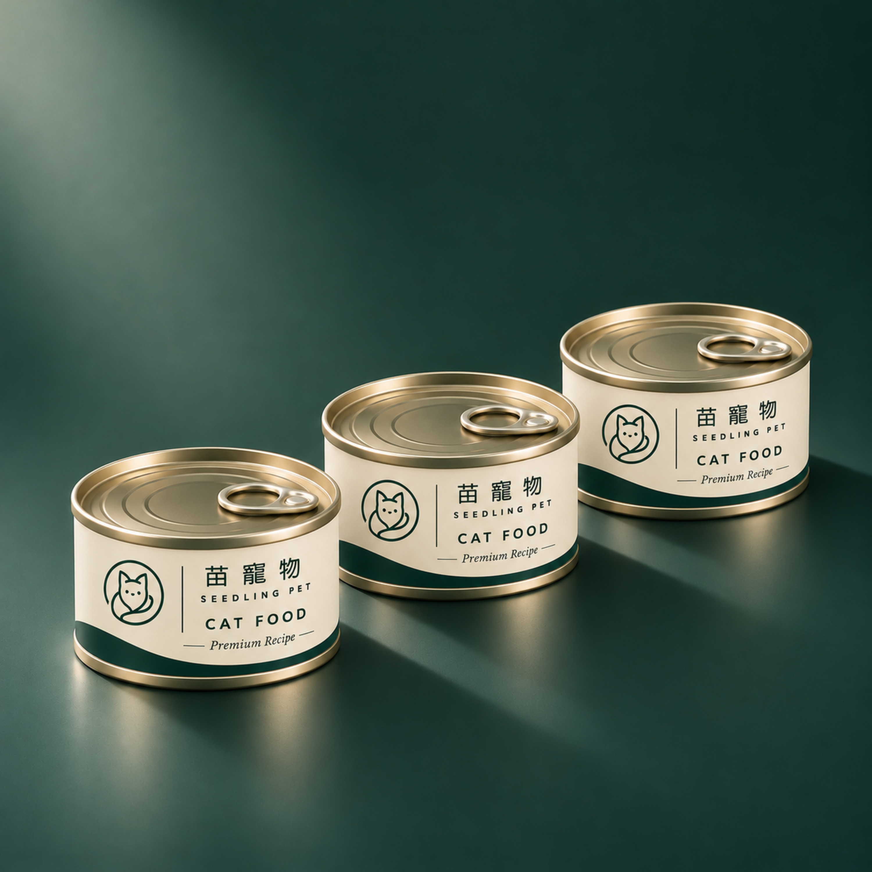
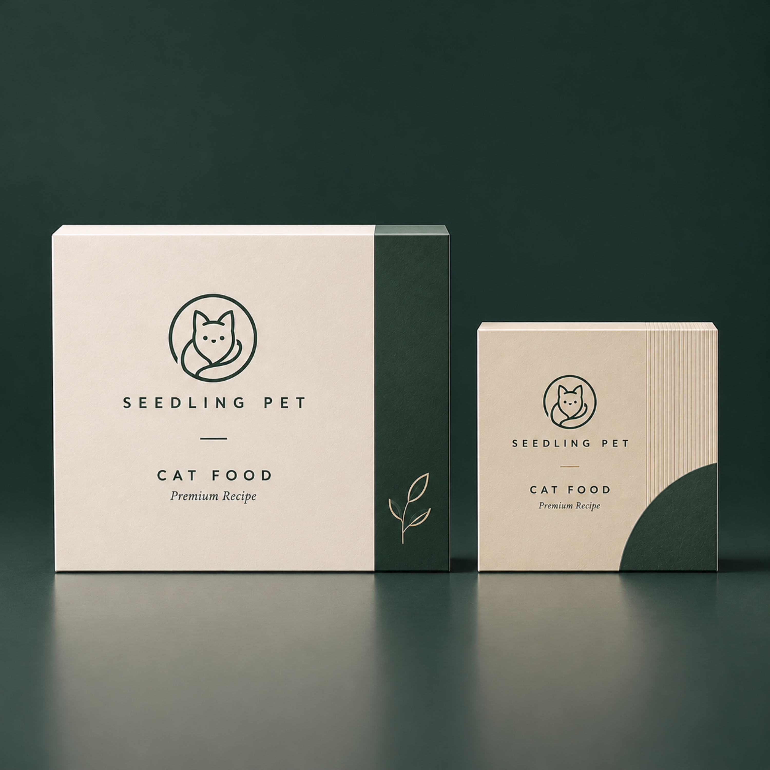
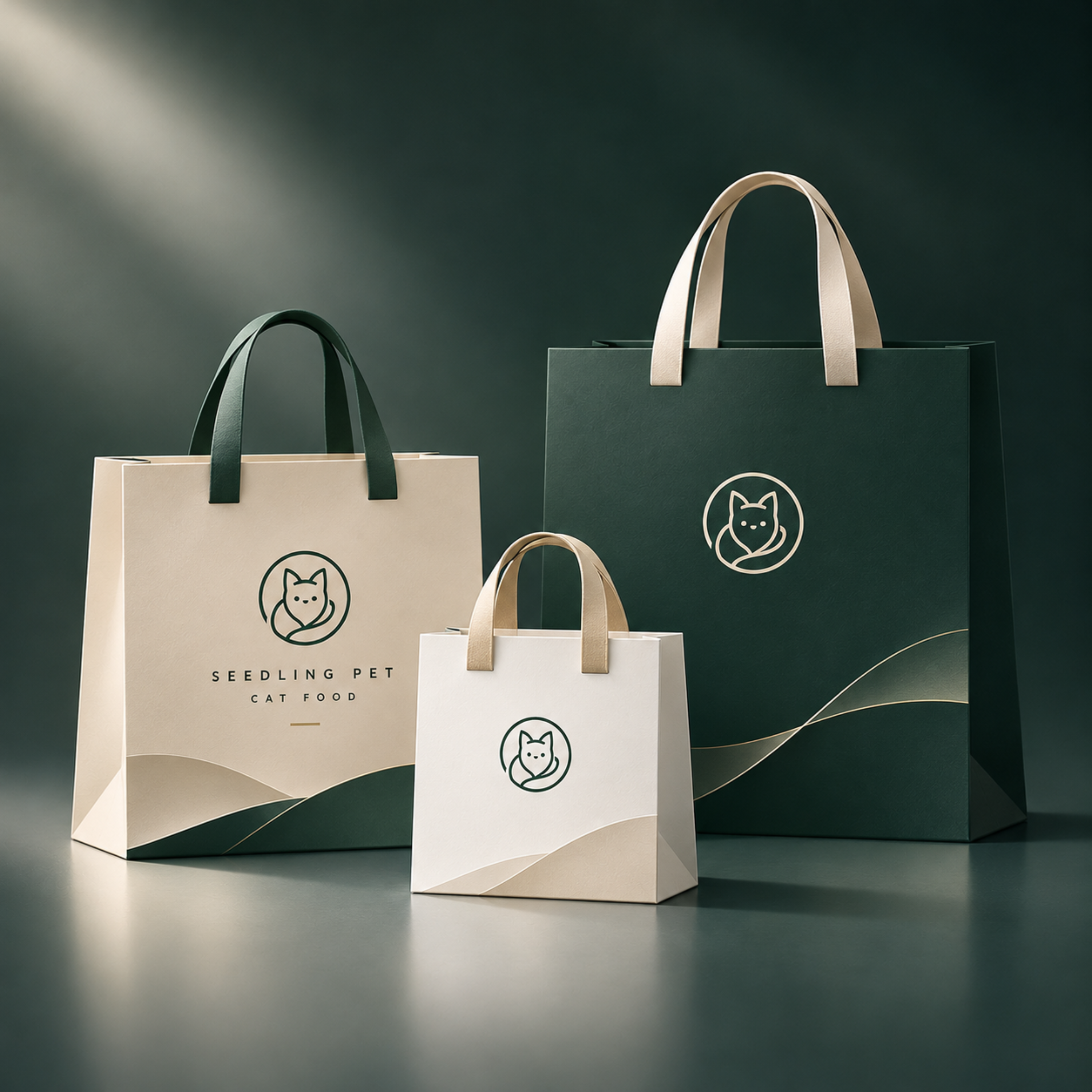
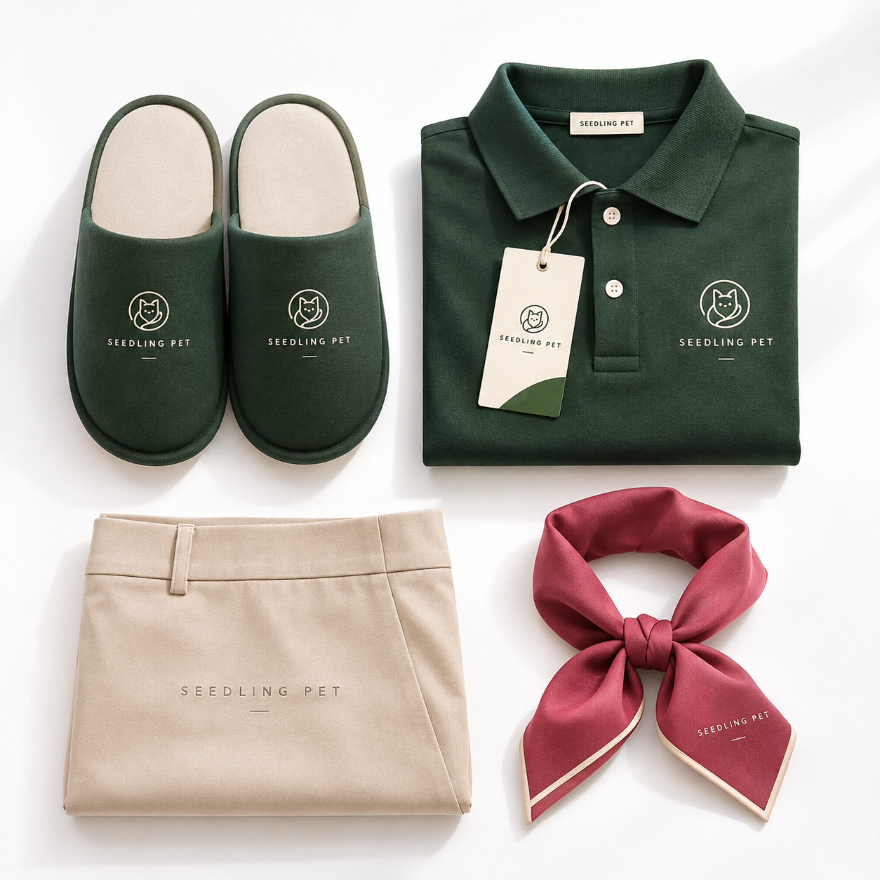
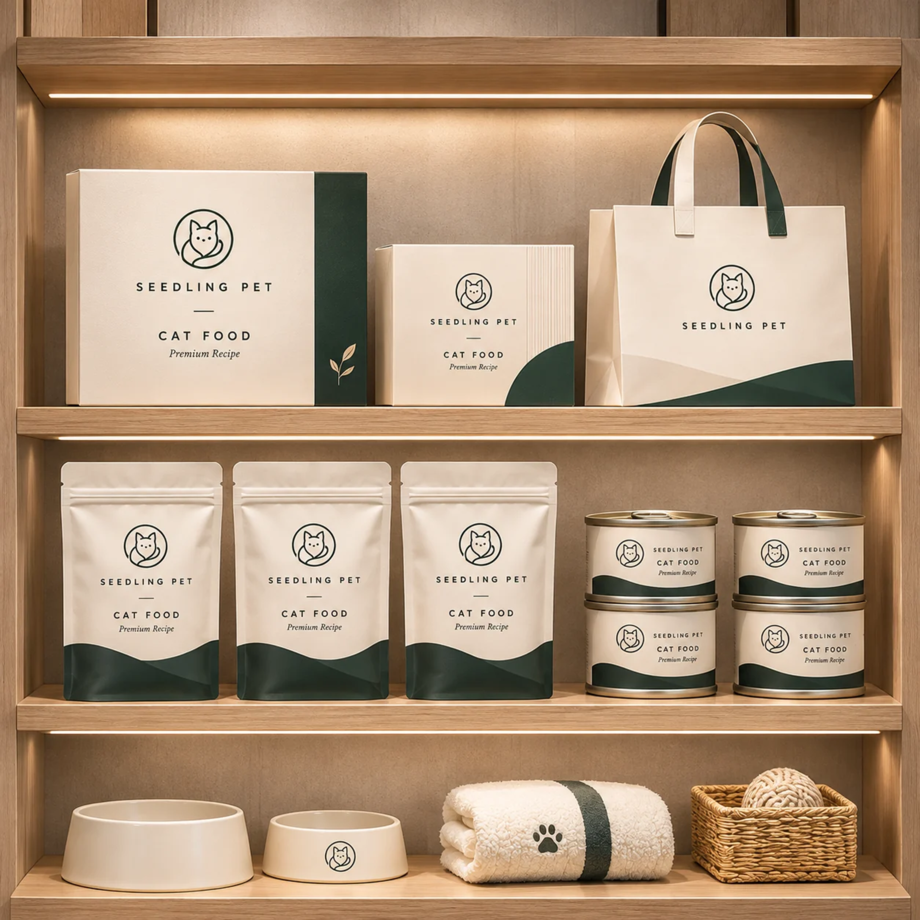
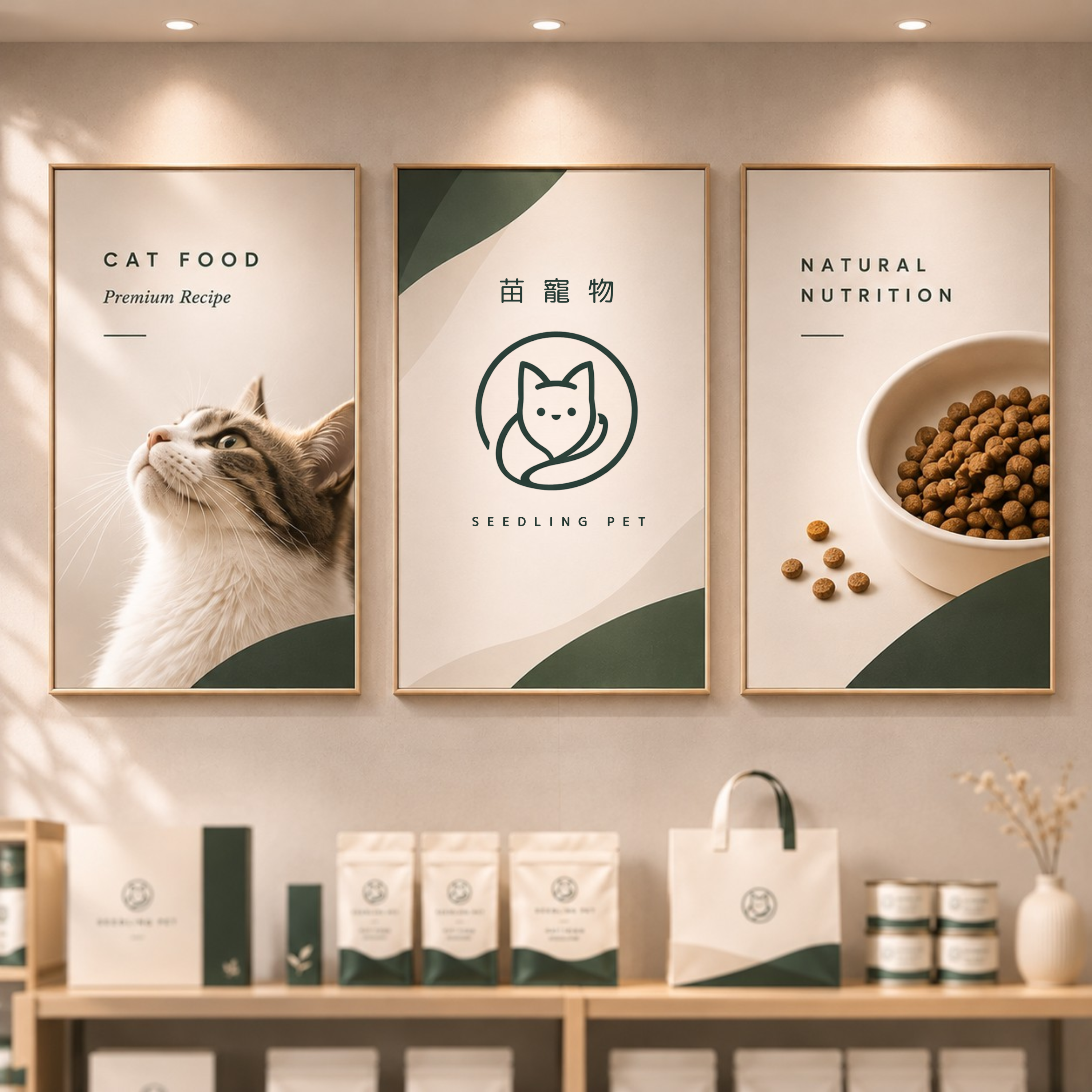
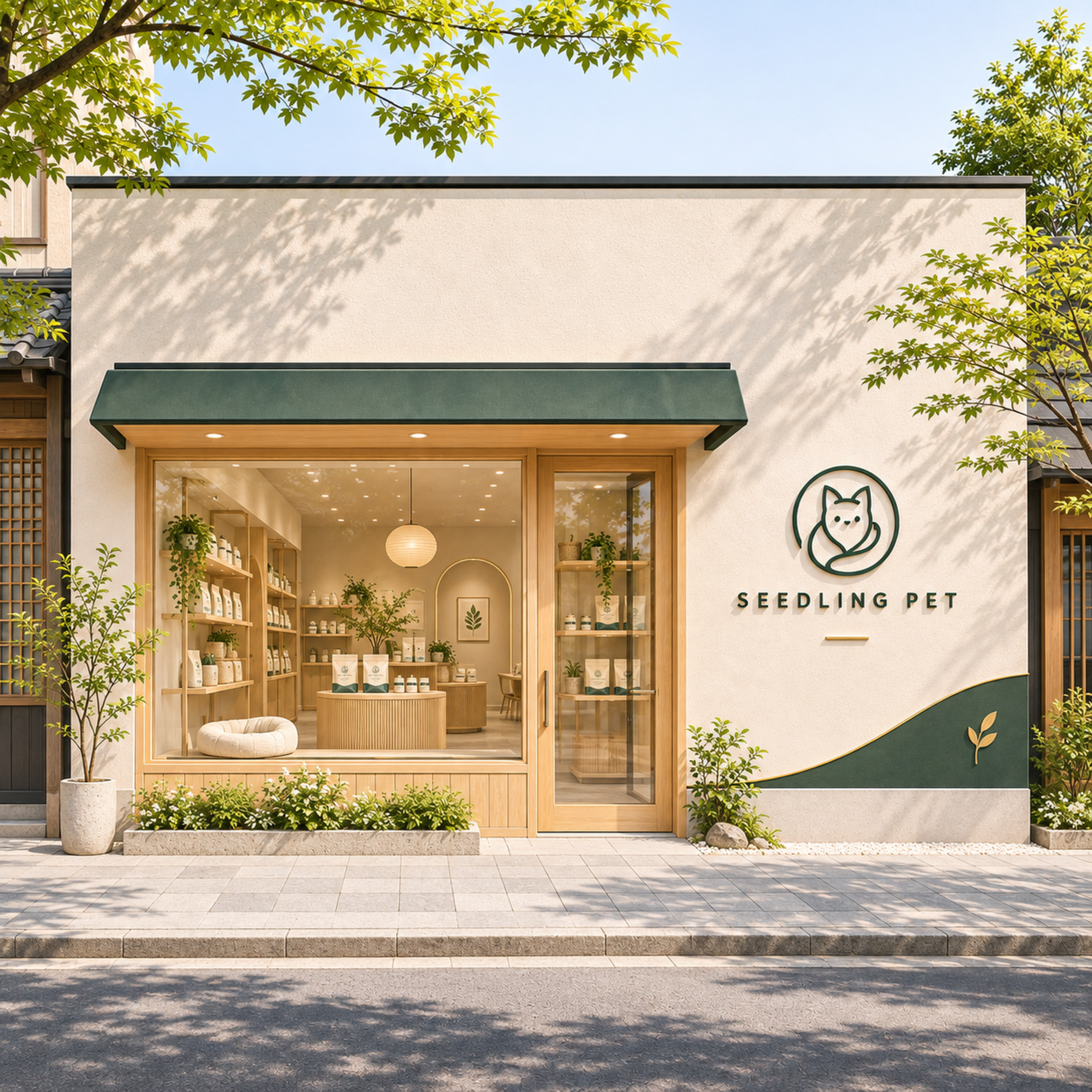
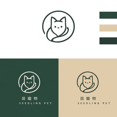
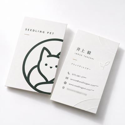
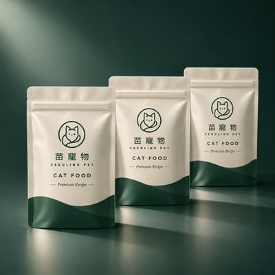
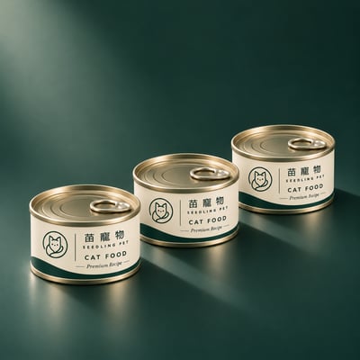
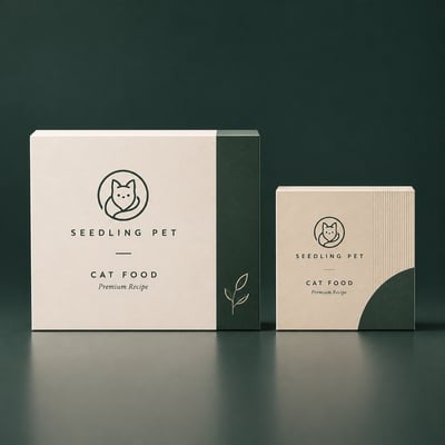
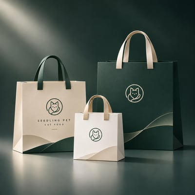
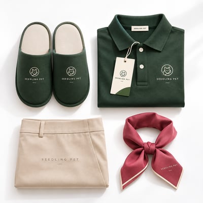
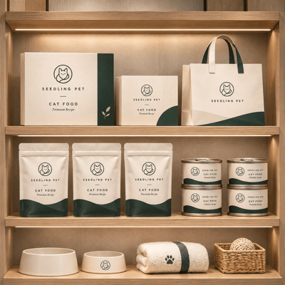
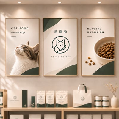
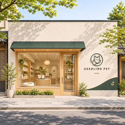
以深綠與米白作為識別主色,將標誌延伸至商品包裝、店鋪空間與各種品牌接觸點。無論呈現的尺寸與媒介如何改變,都能維持一致的視覺印象。
讓一個簡單的符號,成為辨識苗寵物的共同語言。
Brand Identity Design
Starting with the silhouette of a cat, the ears, facial features, and flowing contours are unified into a simple yet distinctive visual symbol.
Rather than relying on conventional notions of cuteness, the design uses geometric precision and soft, fluid lines to create an approachable and memorable brand identity.
A restrained palette of deep green and warm ivory establishes a consistent visual language across product packaging, retail environments, and various brand touchpoints. Regardless of scale or medium, the identity retains its clarity, character, and recognizability.
A simple symbol becomes a universal visual language that defines SEEDLING PET.